Introduction - Portraits = hard
For this brief we were given a multiple choice brief once again and I decided to do the editorial project this time. I chose it because I am at a point where I still struggle with portraits and getting people's likeness right.
Week 1: Mix of celebrities, I chose Idris Elba because my mom likes him and she loves to give constructive criticism
Week 2: Singer, I chose Nana Mouskouri due to her being multilingual
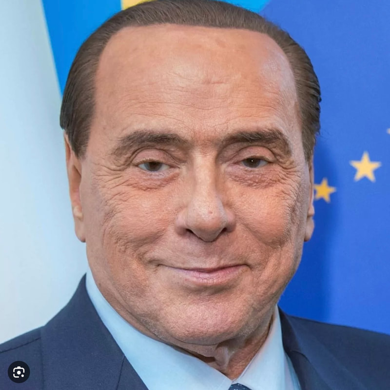
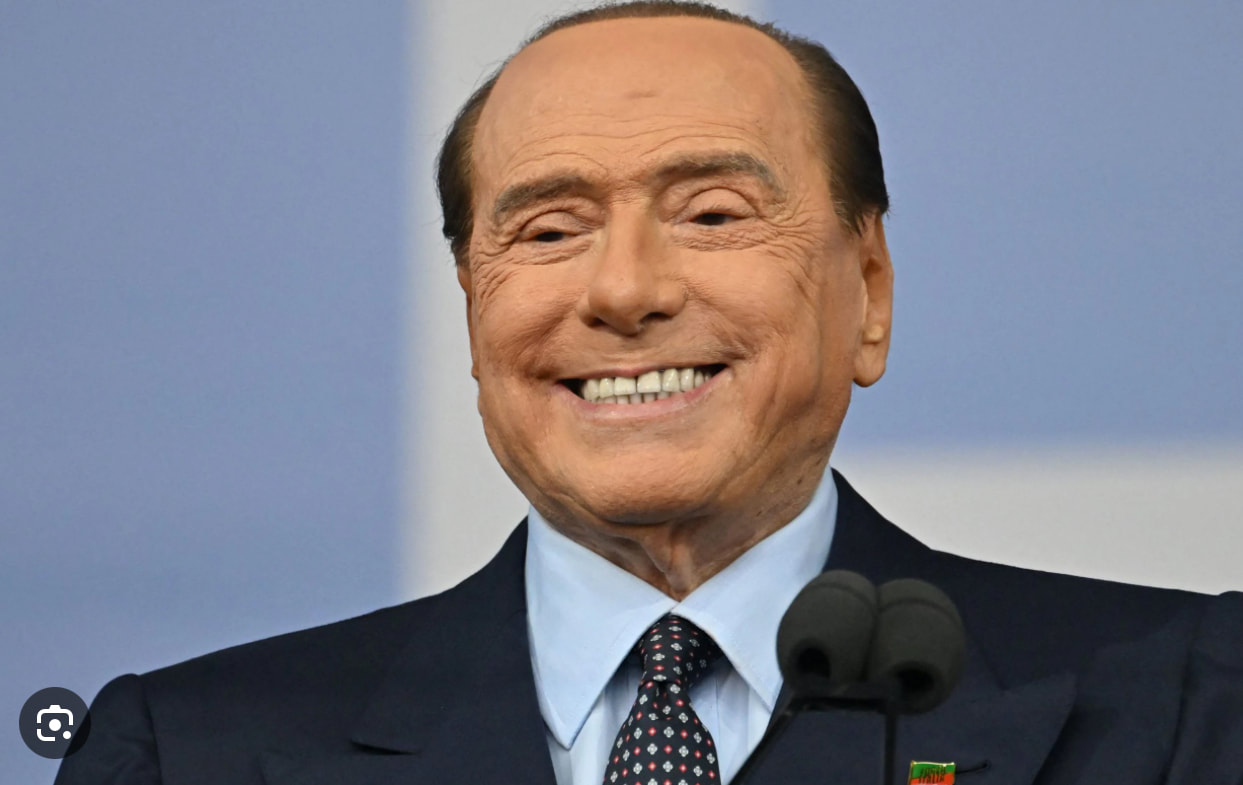
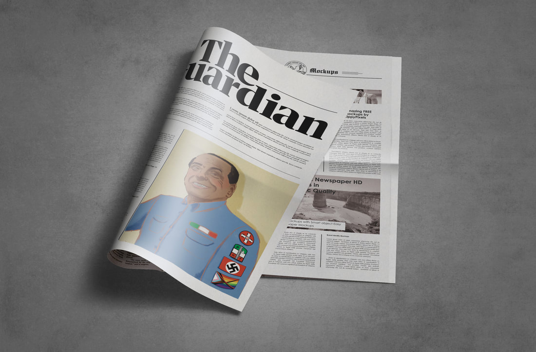
Week 3: Politicians, I chose Silvio Berlusconi because he was a scandalous nasty person
Once we had chosen the celebrity for the week, we had to make sure we knew what message we wanted to convey through the portrait and therefore decide whether we would scrutinise or celebrate the person in question.
Editorial Portrait Examples
Artist Inspiration
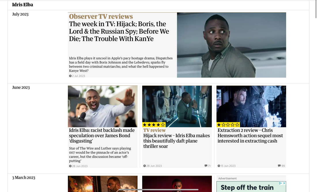
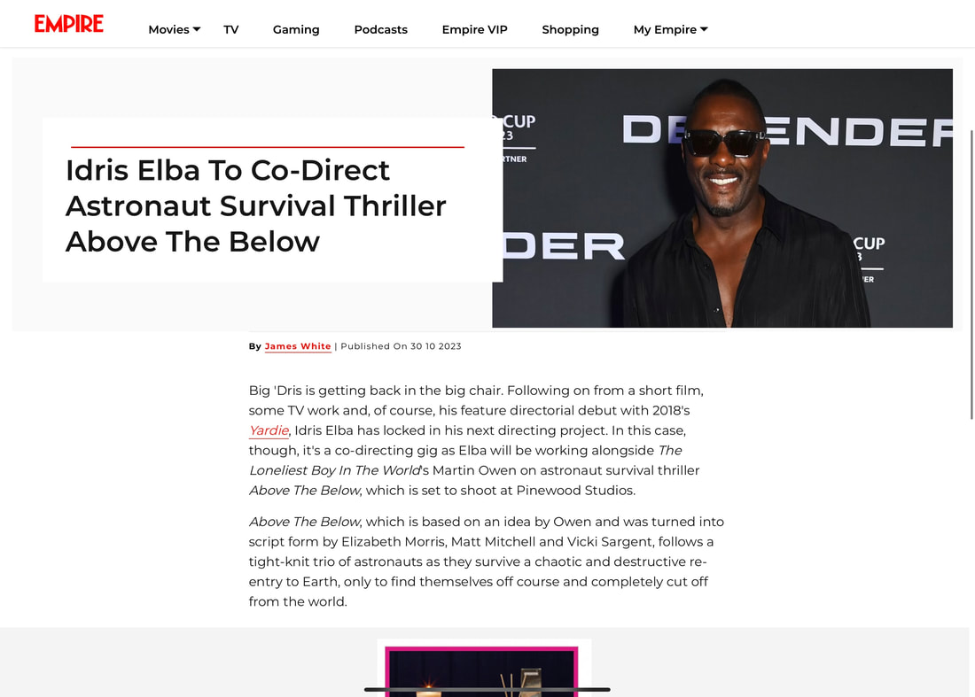
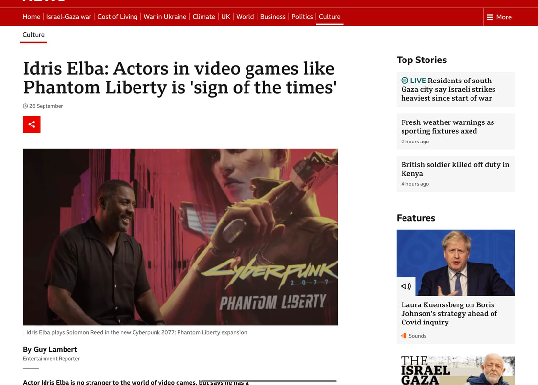
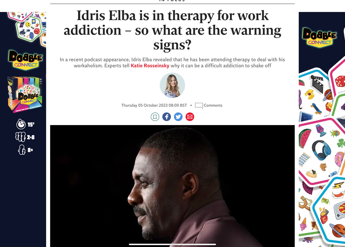
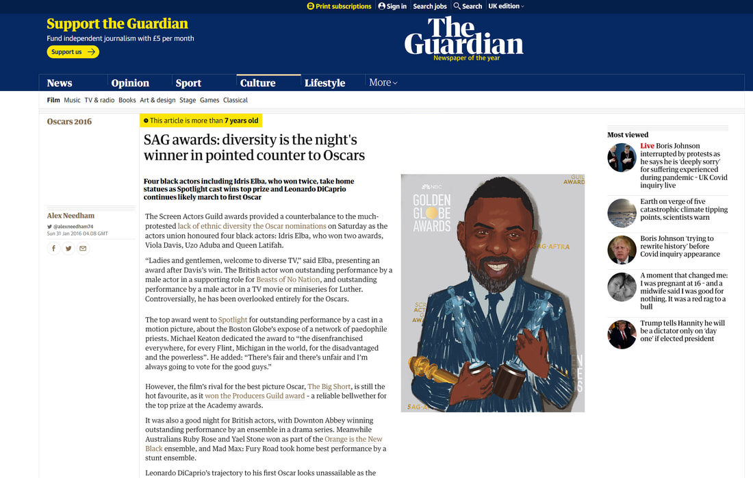
Articles for Idris to get general opinion
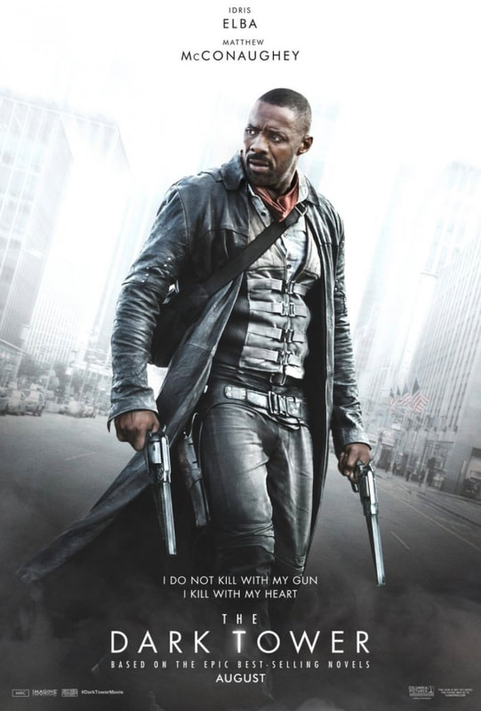
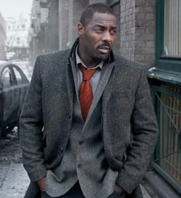
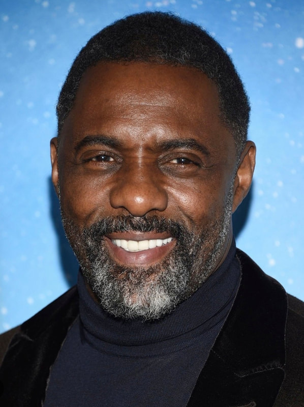
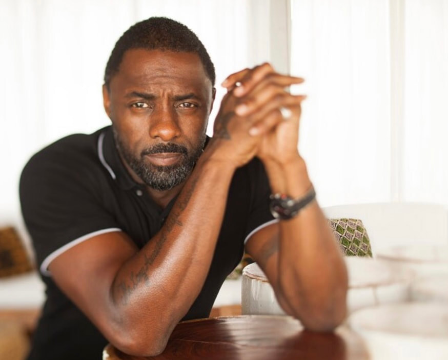
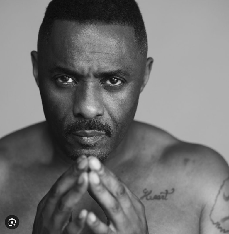
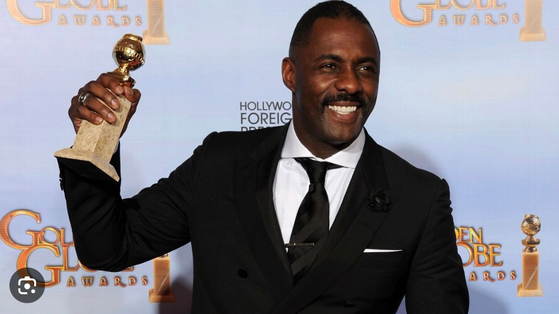
Idris Elba References
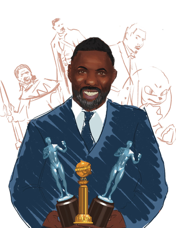
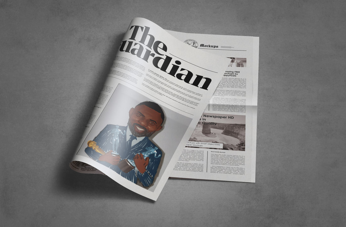
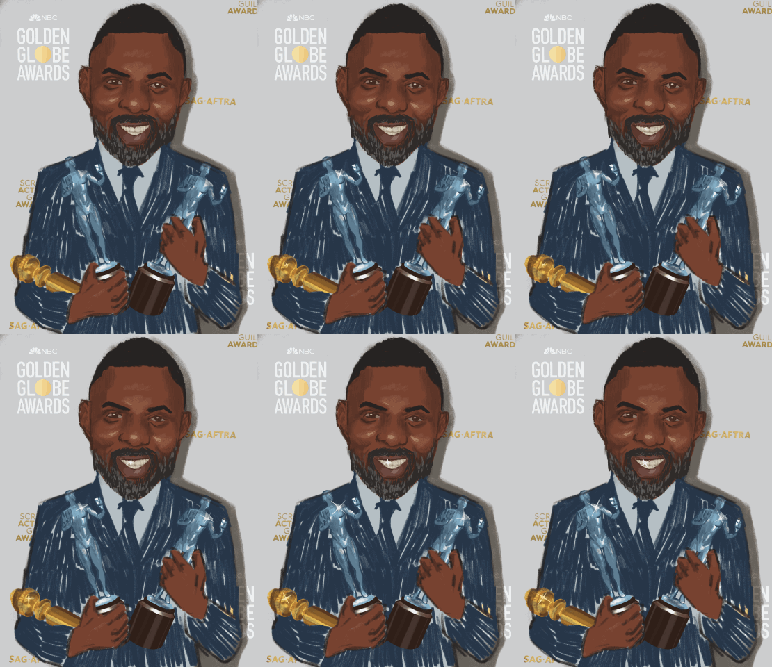
For Idris Elba I decided to create a celebratory portrait due to his talent and versatility as an actor, as he has won many awards and had big successful roles such as Rusell Bell in The Wire, John Luther in Luther, Heimdall in Marvel's Thor Movies and Knuckles in Sonic the Hedgehog.
As well as that he is a very charismatic person with sex appeal, that I hope to get across in my portrait in some way.
As well as that he is a very charismatic person with sex appeal, that I hope to get across in my portrait in some way.
Development
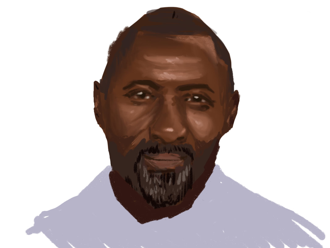
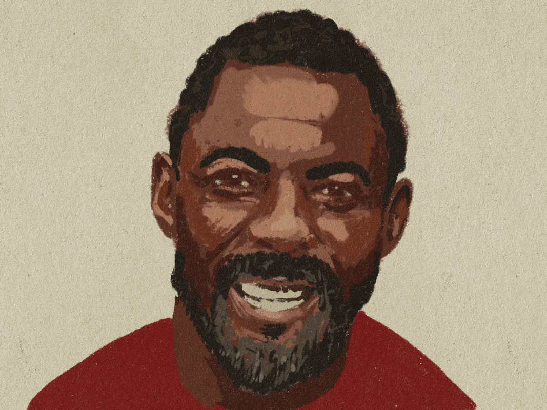
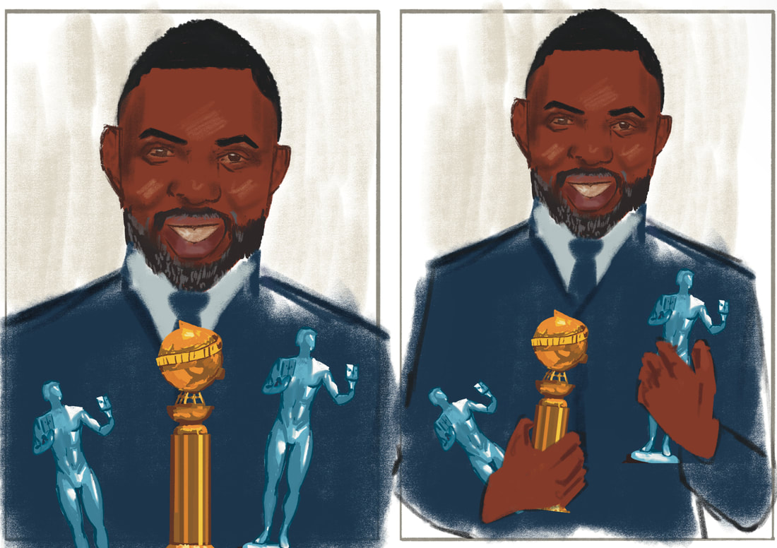
After the initial briefing lecture I decided to start off the project by sketching out Idris Elba and colour him in using two different approaches as a means to get back into creating digital portraits. Through this process I tried to achieve his likeness by figuring out which features stand out and analyse the big shapes I see at first glance.
On my first try I blended out shadows way too much which ended up making him look very smooth, hence for my second try I tried the same approach I took when drawing portraits for my Borgia animation.
On my first try I blended out shadows way too much which ended up making him look very smooth, hence for my second try I tried the same approach I took when drawing portraits for my Borgia animation.
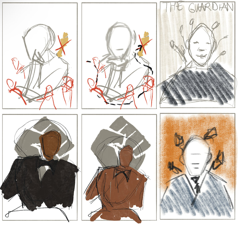
After sketching out the two Idris Elbas, I had to decide on what message I wanted to convey through my editorial portrait of him, as making it look like him alone wouldn't be enough (illustrations communicate). I did thumbnails to explore two different messages that I had in mind:
1him being a role model as a successful black actor from a working class background
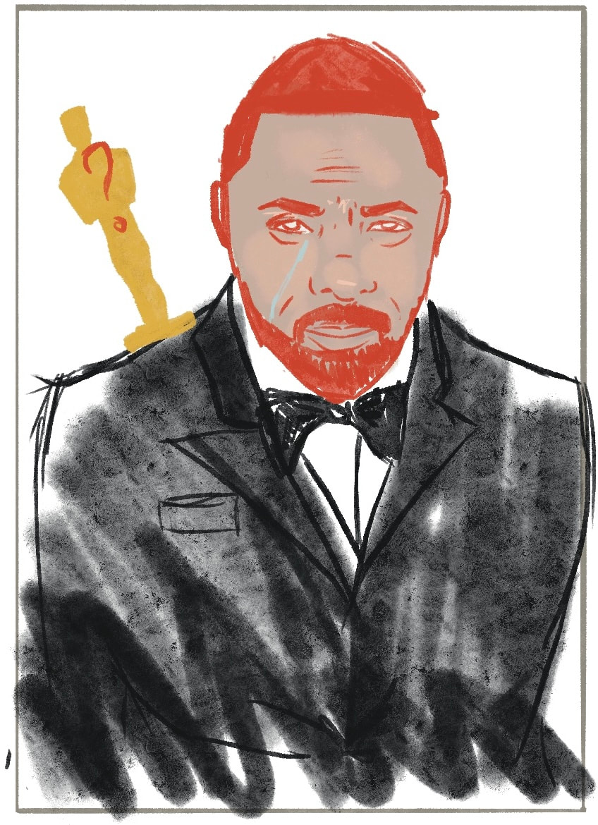
2 him being a good/versatile actor that has won awards but no Oscar yet
1him being a role model as a successful black actor from a working class background
2 him being a good/versatile actor that has won awards but no Oscar yet
After a talk with Dwayne I decided to take the second idea further and tried to think of ways how to communicate that he hasn't won an Oscar. I kind of got hung up on this idea just because of how surprised I was that he hasn't got one yet despite his good work.
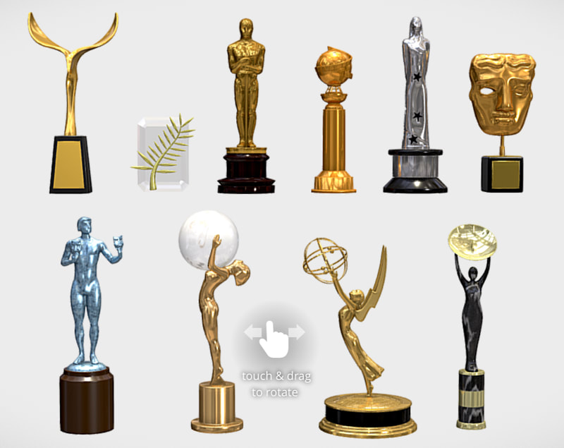
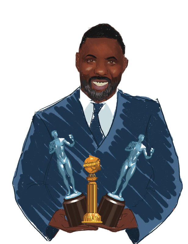
However after the feedback with Tony it was clear I should focus on what he has won instead, rather than what he hadn't won yet. For my portrait I then decided to focus on three big awards he won, a Golden Globe and two SAG awards.
Through my conversation with Tony he mentioned that I could make the background look like a red carpet backdrop or by incorporating his roles/movies he has been in into the portrait. This could be done by either portraying roles he has been in as type or placing the characters roughly sketched in behind him, kind of implying that these characters helped him get this far in his career.
However I felt like adding characters into the portrait would make it feel not only clustered, but also drive attention away from Idris himself, which isn't my intention at all, as this portrait is meant to be about Idris and his talent as an actor.
After Dwayne feedback it was clear that just his likeness wasn't enough and that his hands and awards were in the wrong perspective. Hence I went back to fix those things completely, as well as make the illustration look less digital by using a limited amount of brushes and to avoid blending things together.
I also went back to explore different compositions and as I was playing around with Dwayne (using random filters to get cool effects) making his head bigger would make sense as it would show his content for winning these awards, having his hard work and talent recognised, in the sense that he's so happy he could explode. Additionally it also draws attention to the focal point, his face, as otherwise it competes for attention with the awards being a similar size.
I also went back to explore different compositions and as I was playing around with Dwayne (using random filters to get cool effects) making his head bigger would make sense as it would show his content for winning these awards, having his hard work and talent recognised, in the sense that he's so happy he could explode. Additionally it also draws attention to the focal point, his face, as otherwise it competes for attention with the awards being a similar size.
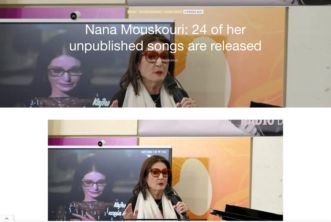
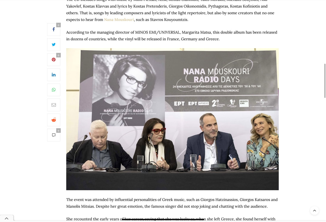
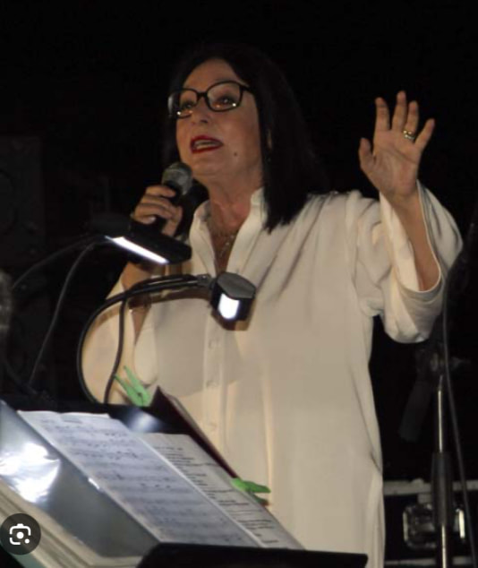
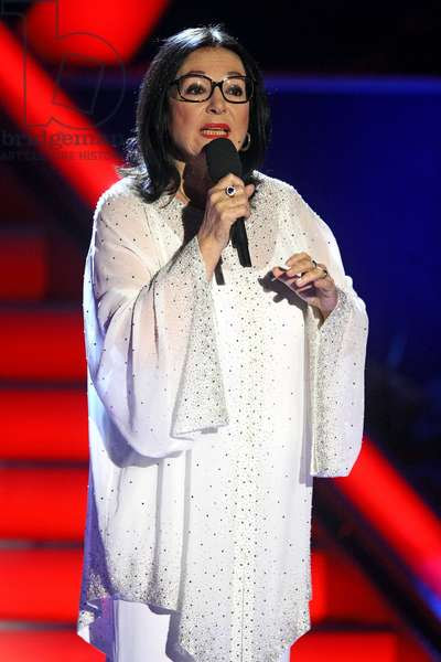
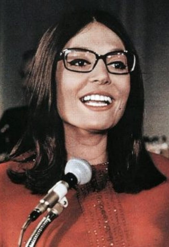
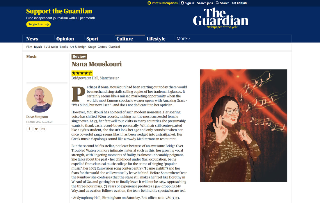
Not the most recent articles about Nana Mouskouri
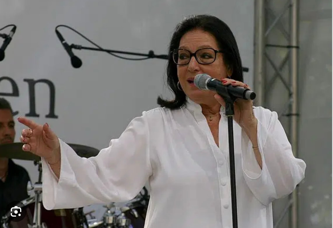
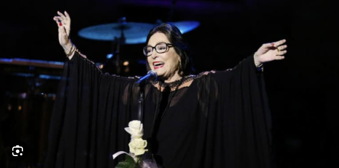
Nana Mouskouri References
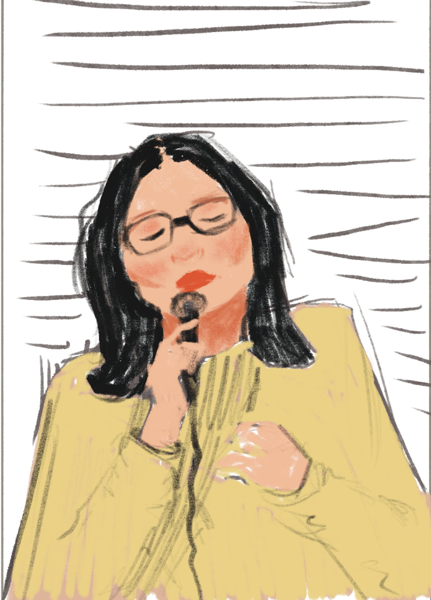
Out of the list of singers available to choose from, I only knew of four, which were obviously all taken. So I had to do a little research beforehand and found out about Nana Mouskouri being very famous for the amount of songs she has released in at least 12 different languages, which is quite impressive.
I noticed very quickly that I would have to practice drawing glasses, as it can sometimes look more drawn on and want to achieve 3-dimensionality with them so it looks like they are actually on her face.
I noticed very quickly that I would have to practice drawing glasses, as it can sometimes look more drawn on and want to achieve 3-dimensionality with them so it looks like they are actually on her face.
Development
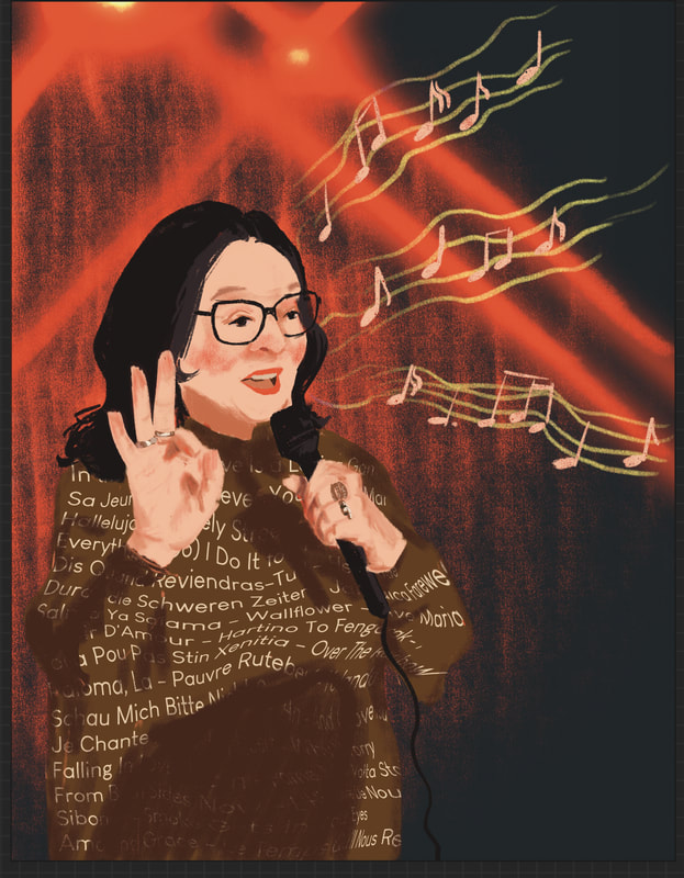
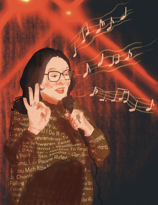
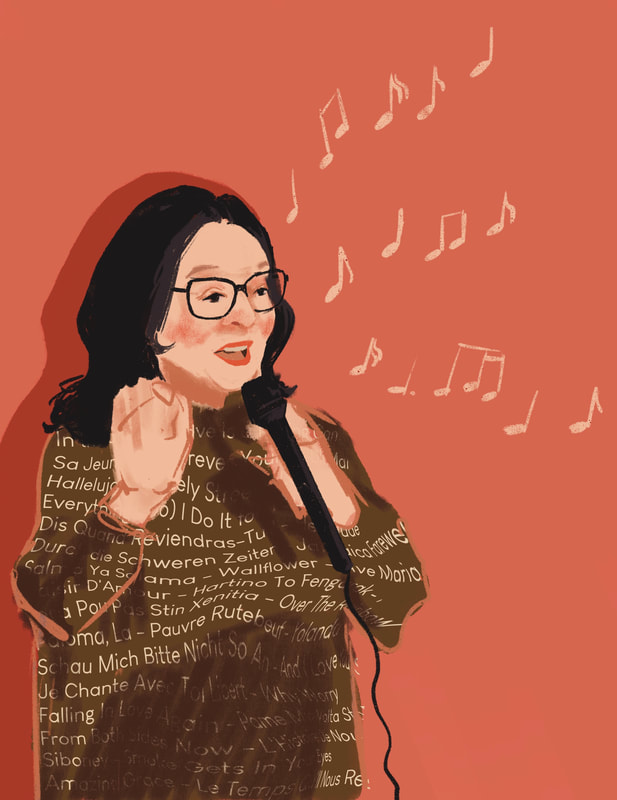
Due to her impressive discography and the fact that she is multi-lingual, I decided to make this a celebratory piece.
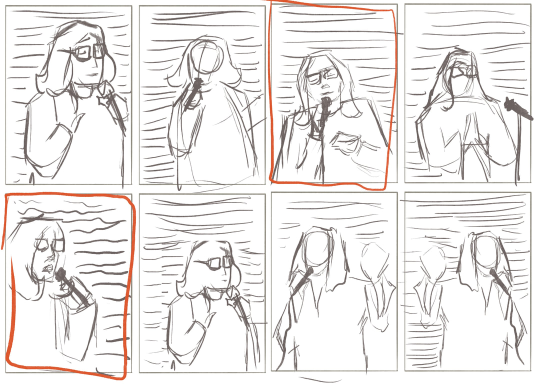
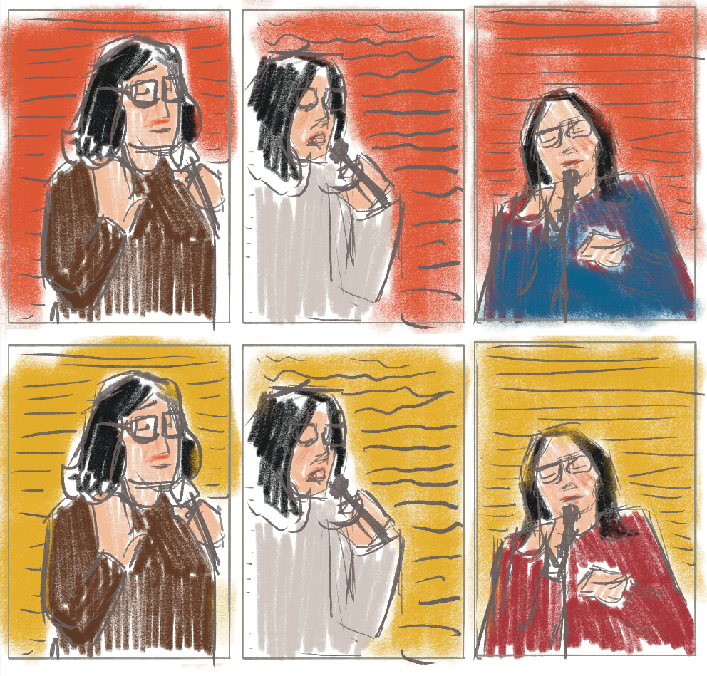
I wanted therefore to incorporate song titles in the background, similarly adding text in the background like in the Idris Elba piece and created little thumbnails to decide composition and posing, focusing on interesting composition and silhouette.
I wanted therefore to incorporate song titles in the background, similarly adding text in the background like in the Idris Elba piece and created little thumbnails to decide composition and posing, focusing on interesting composition and silhouette.
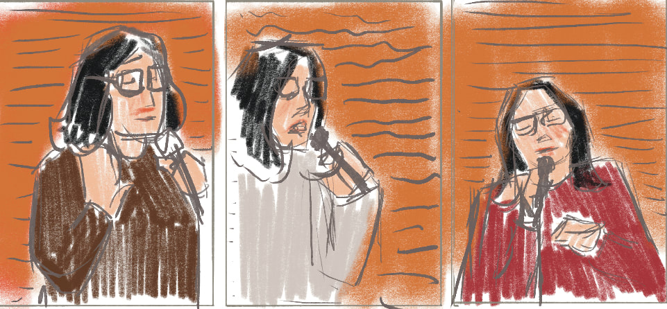
I decided on my favourite thumbnails and coloured them in with different combination to give me an idea of what she could wear or what colour light could be in the background.
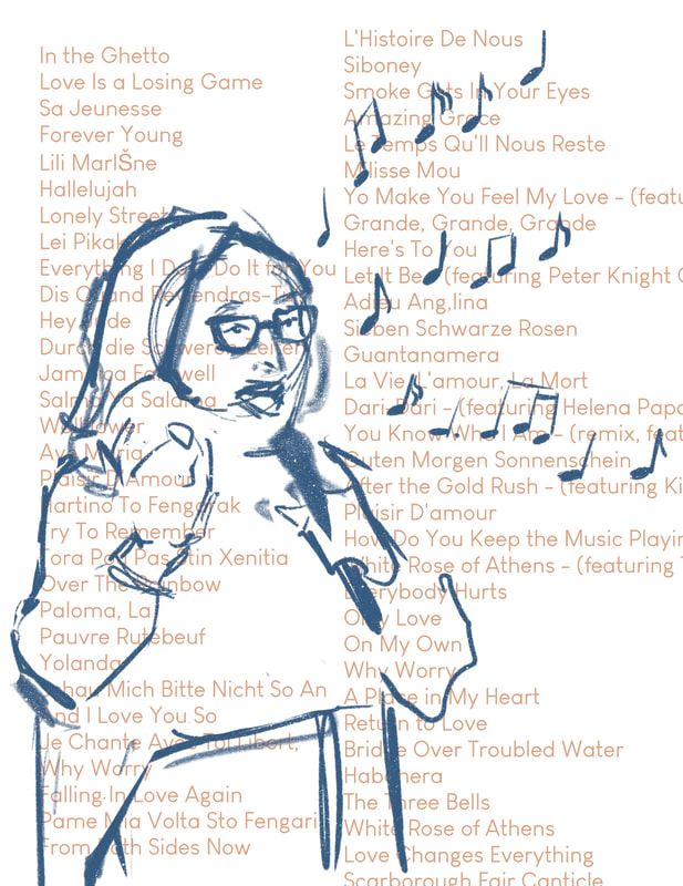
My initial idea was to have a collection of song titles she's written in the background, to celebrate the sheer amount she has come up with during her career.
After talk with Dwayne he pointed out that text has it's on movement and will most likely distract from the portrait itself, which is not what I would want.
So I came up with the idea to place some song titles on her clothing, kind of acting as a pattern.
After talk with Dwayne he pointed out that text has it's on movement and will most likely distract from the portrait itself, which is not what I would want.
So I came up with the idea to place some song titles on her clothing, kind of acting as a pattern.
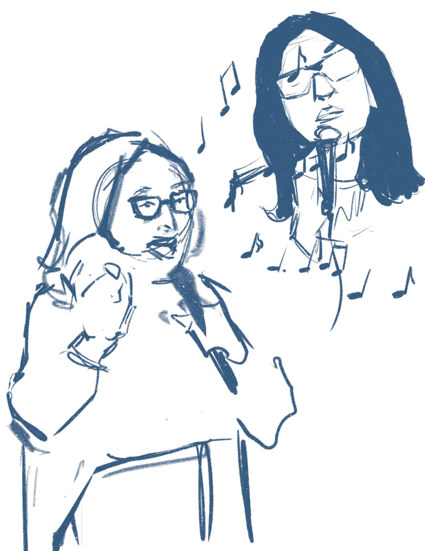
However when I crudely overlaid text, I noticed how crowded and overpowering the background got and that it wouldn't quite look like the way I had imagined. I then decided to make a choice on visual style and explored it with the pose down below first, but I didn't like how front on the pose was and wanted to make use of a more interesting silhouette, which would then draw more attention to her iconic and recognisable glasses and haircut.
To explore the background I looked at images of her performing at concerts and how I could imply concert lighting in the background. For the lighting I knew I wanted to achieve a happy/uplifting mood.
To explore the background I looked at images of her performing at concerts and how I could imply concert lighting in the background. For the lighting I knew I wanted to achieve a happy/uplifting mood.
For the final portrait of Nana Mouskouri I went back to add hints of blue to her glasses and shadows to avoid everything blending into each other, since the portrait contains a lot of warm tones and needs a bit of contrast which was kindly pointed out by Tony.
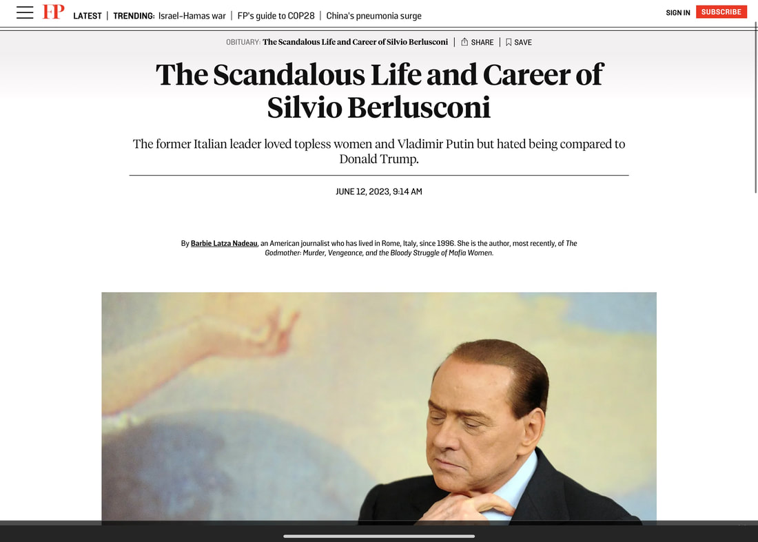
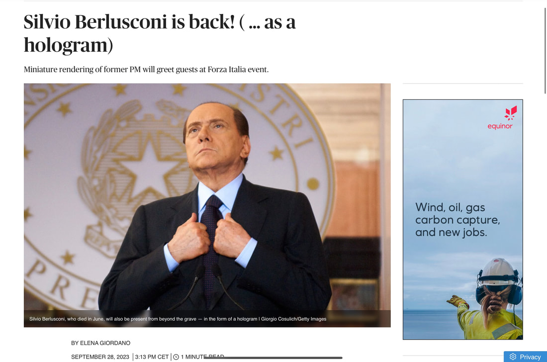
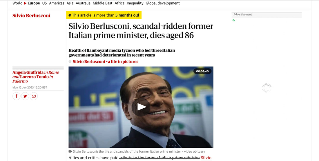
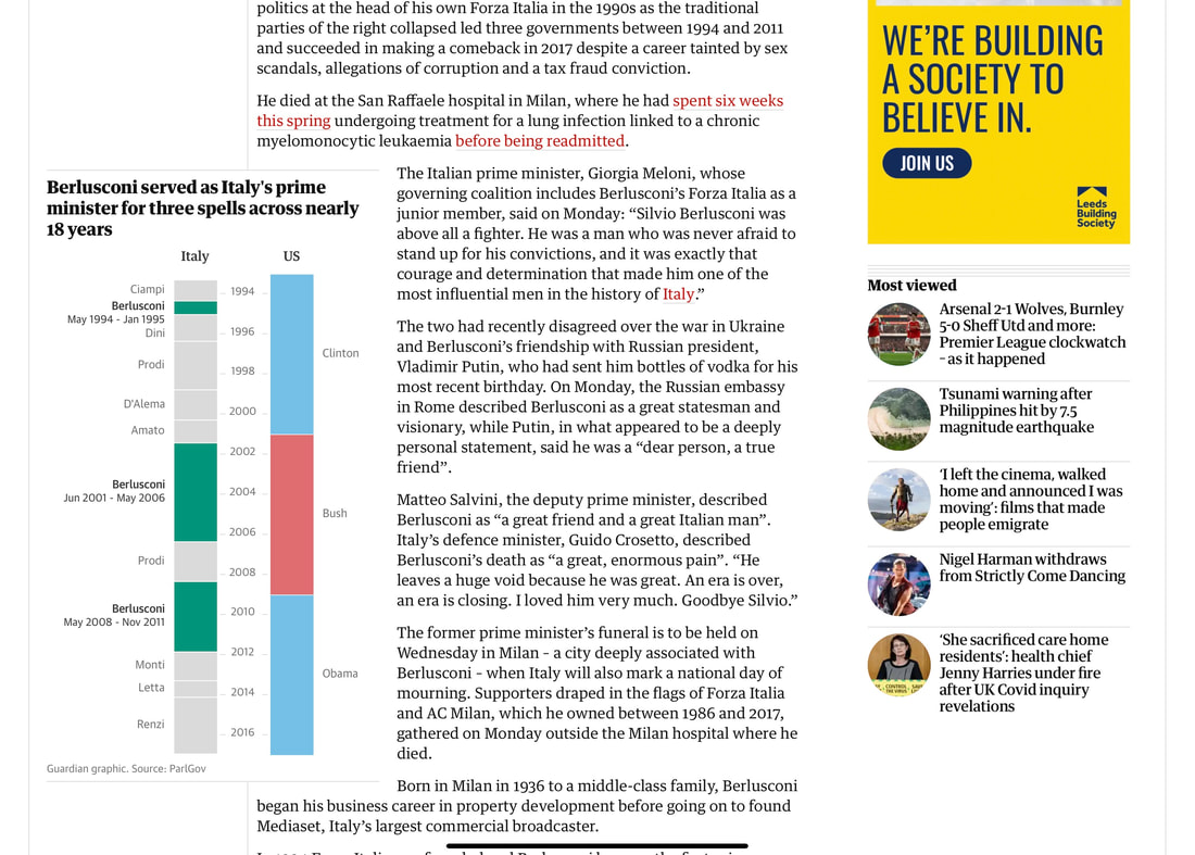
No super recent articles for Silvio, because he died in June 2023
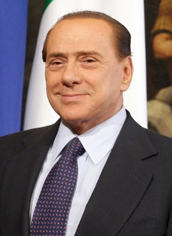
Silvio Berlusconi References
I don't like him for very obvious reasons mentioned below, hence his likeness will be scrutinised in my portrait.
He was a far right politician that was openly racist, homophobic, sexist, antisemitic, need i say more? He had a scandal when media found out that he kept organising orgies with exactly 20 prostitutes and one of them was underage, belly dancer Ruby Rubacuore (rubacuore = heartstealer)
He was also obsessed with having sex and thought he was desirable. His latest lover looks 20+ years younger.
It would be interesting to include one of his many outrageous quotes in the portrait to highlight the way he looks at and treats other people.
Silvio Caricatures
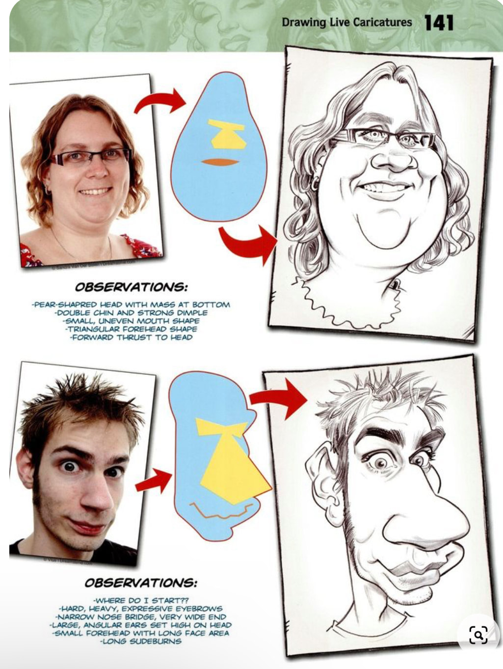
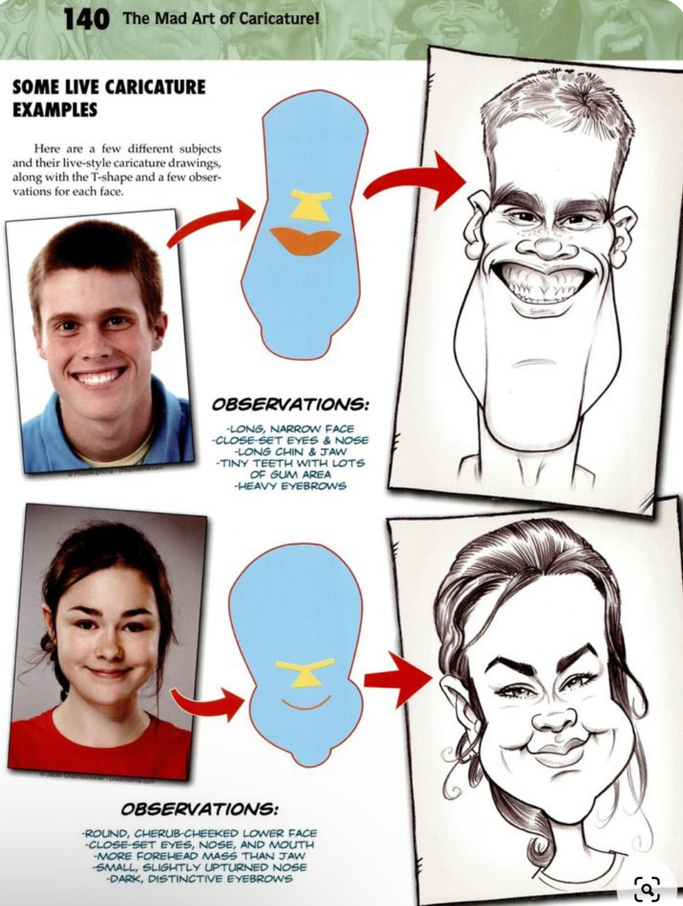
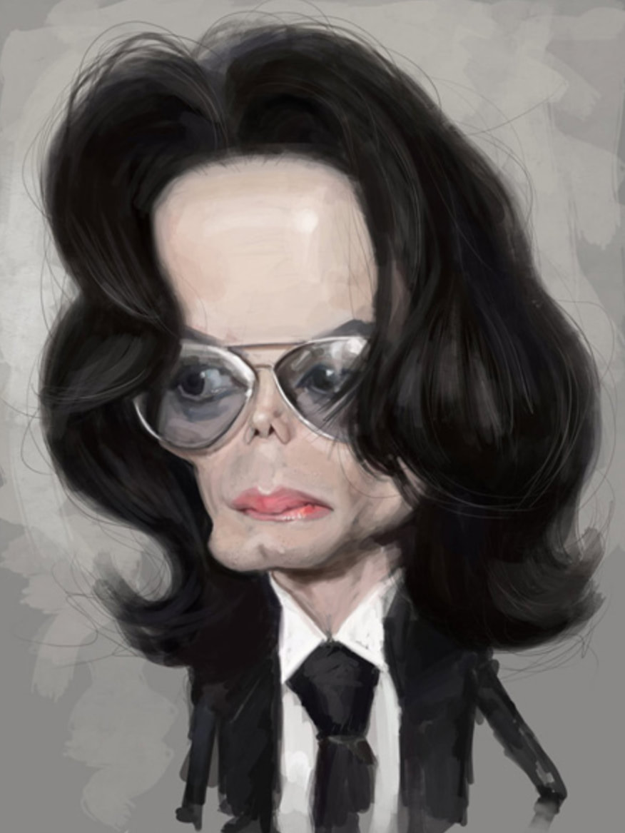
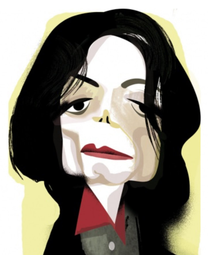
looking at caricsature exampls, how they emphasise certain features while making it look believable and keep his likeness
Development
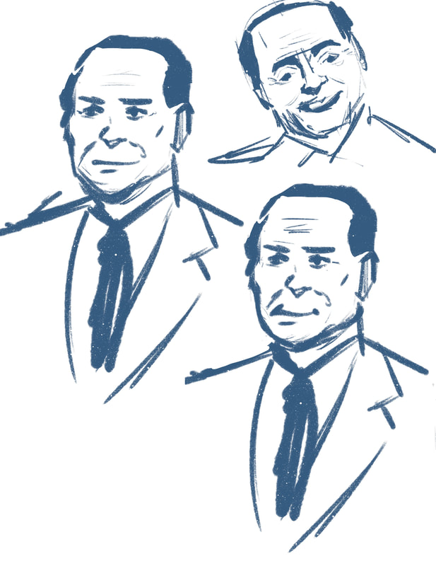
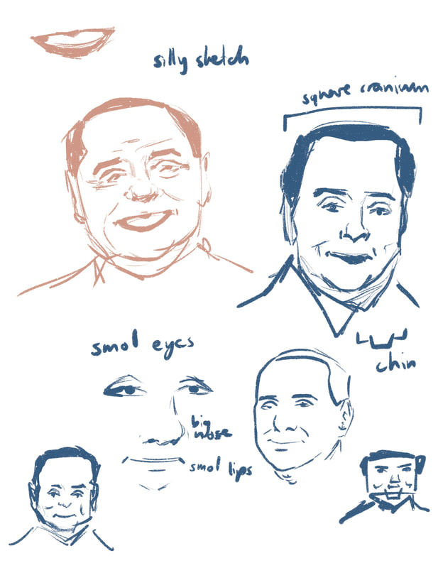
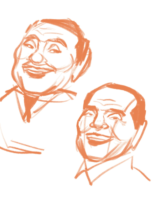
similarly to idris sketched silvio a couple times to help identify what his distinct features are and the general big shape of things, distinct features are small eyes big nose square head and small thin lips, funny chin
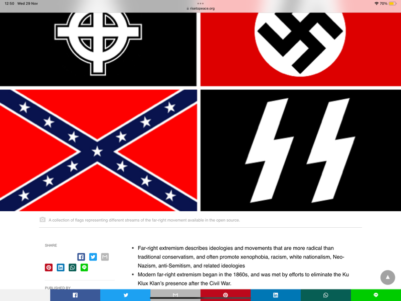
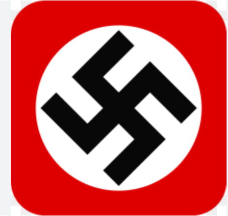
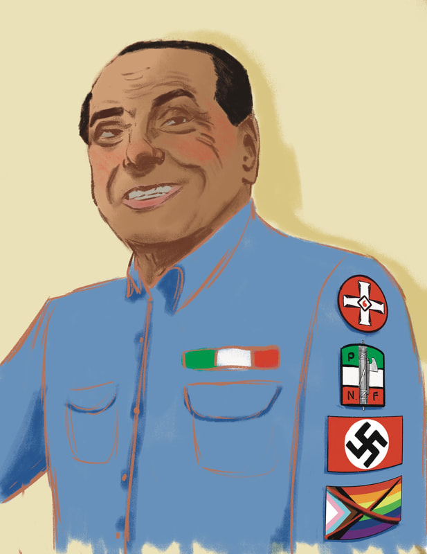
For this portrait I had an idea in mind for its message straight away. He was part of a very far right political party called Forza Italia and is known to have had a hatred for a lot of different groups of people. I wanted to incorporate his hatred for these groups that he proudly and outwardly voiced to the public using foul language, I thought to incorporate it symbolically by using hate symbols that he was collecting like awards or scout badges.
At the feedback Tony let me know that the message does come across well which I was pleased to hear. He suggested to use more of a caricature style to capture his likeness, as I kept mine a bit too close to the reference material and made him look nicer than he was, which I agreed with.
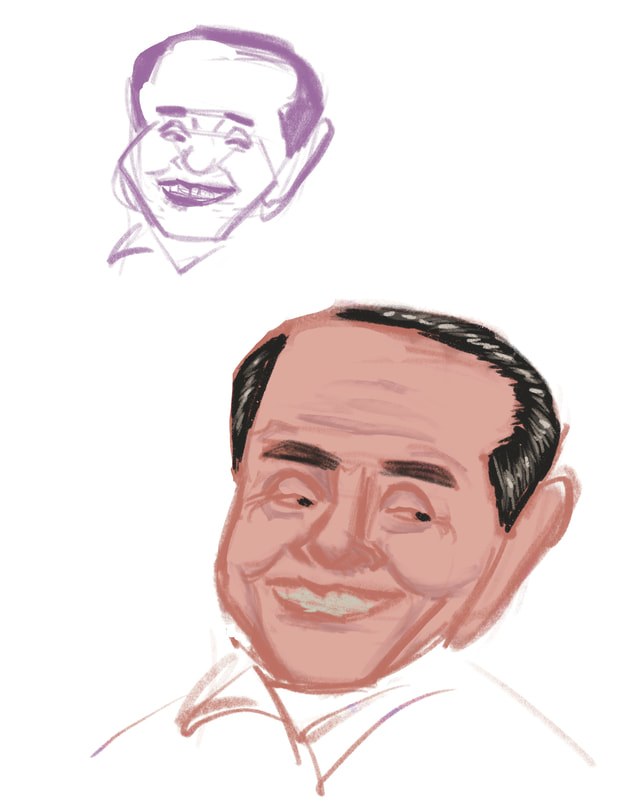
I started to play around with proportions and put the first portrait through different filters, seeing how far I can push it until it stops looking like him.
Once I was happy with the proportions, I started the drawing process and kept my other two portraits on reference to ensure that they have the same stylistic look.
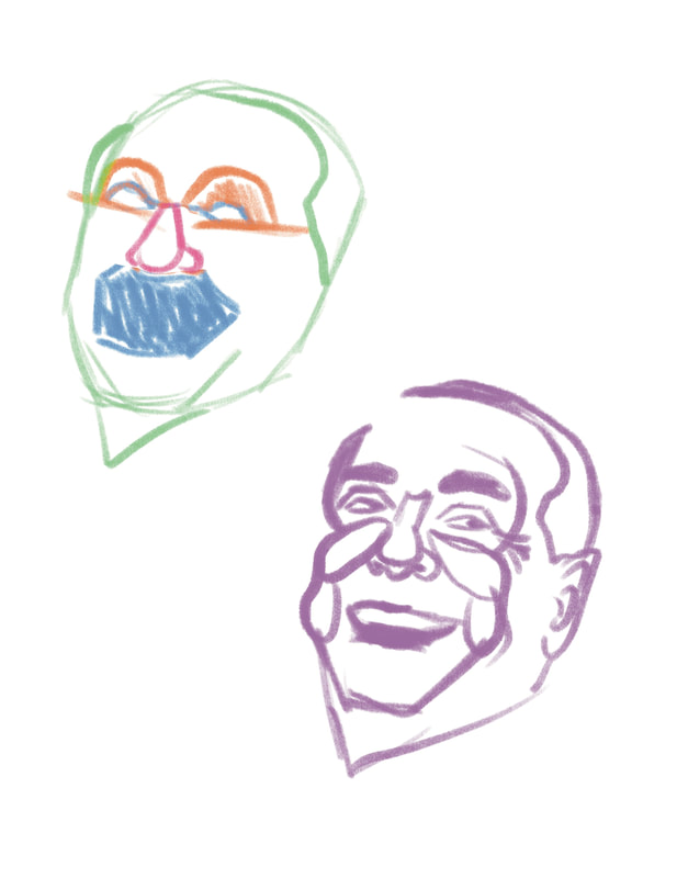
After finding the helpful book 'The Mad Art of Caricatures' I tried to implement some aspects explained in the book and broke down Silvio's face into its big rudimentary shapes and volumes to have an idea of what to emphasize/exaggerate without losing his likeness, such as enlarging his bulbous nose while bringing up the mouth to balance it out. The picture on the far right has lost his likeness too much but I did like how much Schadenfreude (= german word for enjoying someone's suffering/pain) there is shown on that face and wanted to make sure it came across in the final portrait.
I also wanted to make sure to draw focus to his mouth as well as his teeth look weird after he had been assaulted a few years prior and had to get his jaw and teeth fixed.
I also wanted to make sure to draw focus to his mouth as well as his teeth look weird after he had been assaulted a few years prior and had to get his jaw and teeth fixed.
Then I thought about what to incorporate into the background and first thought of making it look like a press conference, as he does love to talk bad about the things he doesn't like. However considering the article chosen isn't about something specific he said but his entire career, I thought incorporating women prostitutes' legs in the back could be interesting, symbolising that sex and women were always at the back of his mind because sex was in his mind a lot. It would be fitting. However I did realise that this background could be too much for the portrait I am doing with the message I am communicating already, so I went with a simpler background of one of his Forza Italia conferences.
