Introduction
During the process of writing my dissertation I discovered how interested I actually am in Shinto and the gods/kami that appear in it. As their appearance can be interpreted in many ways, I thought it could be a more fun side project to go along with the short film.
I initially thought of making the cards myself using Mixam to get prints of the artwork and make the card packaging myself but I have found a custom card game company that was kind enough to offer free card samples and I hope I can work together with them to make the card game look professional.
The goal is to have at least 15 different cards designed, aiming for one design to be finished in one/two days.
Outcomes:
At least 4 individual card designs
Designed packaging
If not possible to make the cards reality, create 3d ad/promo post of them
Inspiration
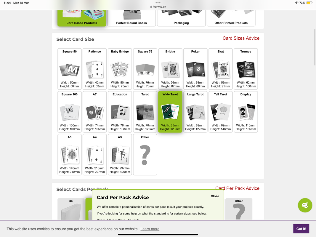
If I wanted to make actual card I found a nice company that was kind enough to send me their card samples and sizes. This has helped me decide on either a normal tarot card size or wide tarot card size, leaning more towards the wide one.
To get an idea of how expensive this service would be, they gave me a sample quote where 20 packs of 48 cards in a matte laminated box would cost me around £268. This would set me back a lot of money so I could potentially opt for making the cards through Mixam.
To get an idea of how expensive this service would be, they gave me a sample quote where 20 packs of 48 cards in a matte laminated box would cost me around £268. This would set me back a lot of money so I could potentially opt for making the cards through Mixam.
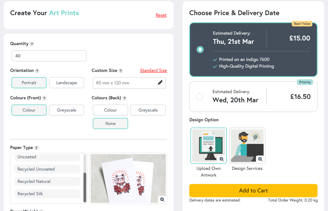
Down below would be the price per individual card, if I were to make 40 packs of cards and get boxes made by Ivory Graphics. Alternatively I could turn this funding issue into a Kickstarter campaign!
Research
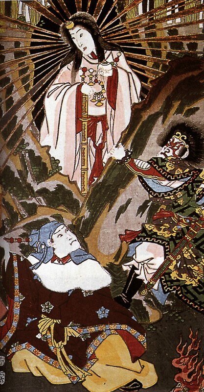
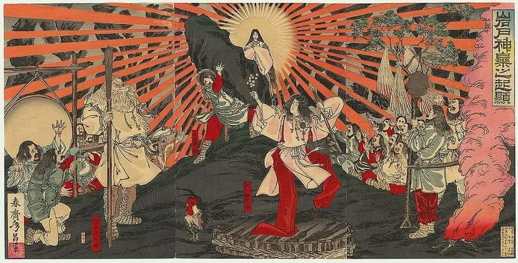
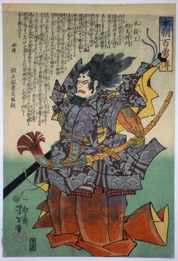
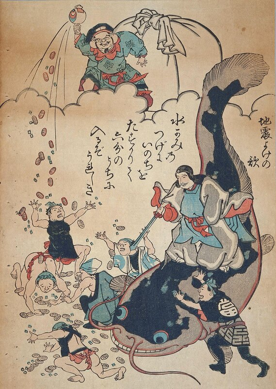
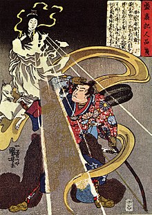
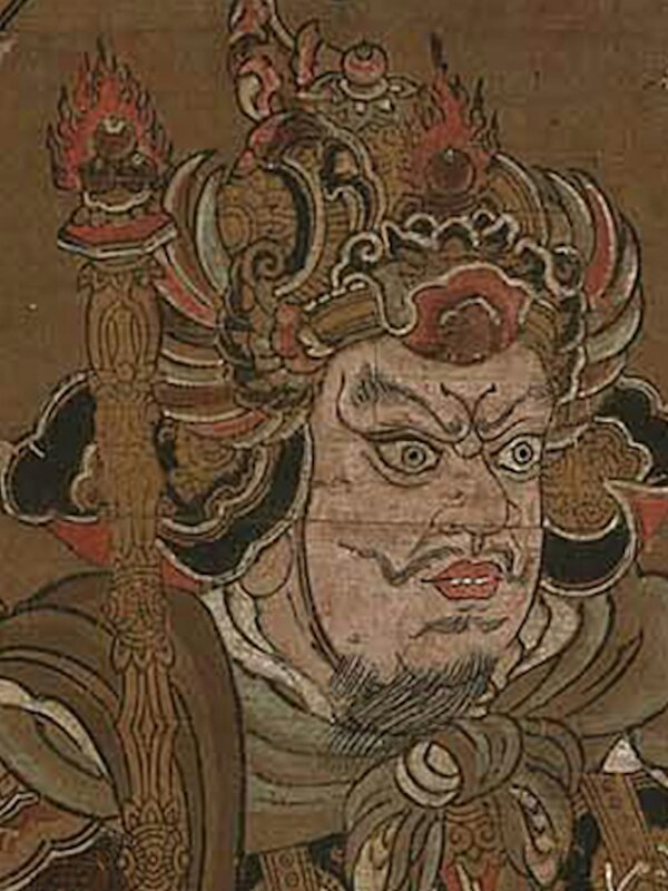
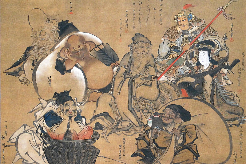
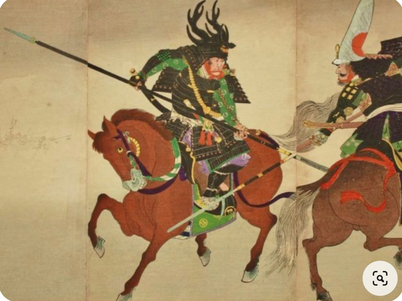
Here to include inspiration looking at Japanese traditional depictions of kami to honour them but obviously put my own spin on it, trying to showcase my understanding of design principles.
|
|
|
|
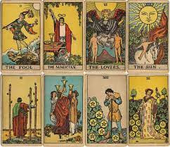
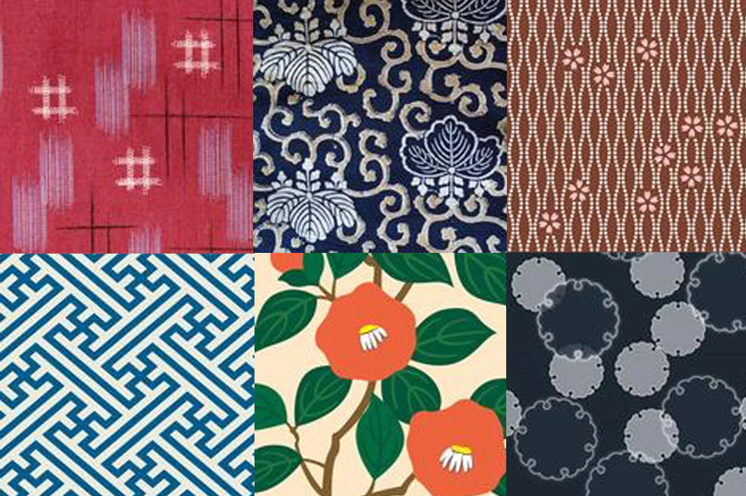
Traditional tarot cards have decorative borders and a decorative pattern on the back of the card. I am to create a pattern that will be seamless and immediately read as Japanese. I also want to make sure to make it look luxurious to accentuate the gods.
Reference Images
Ideas and Development
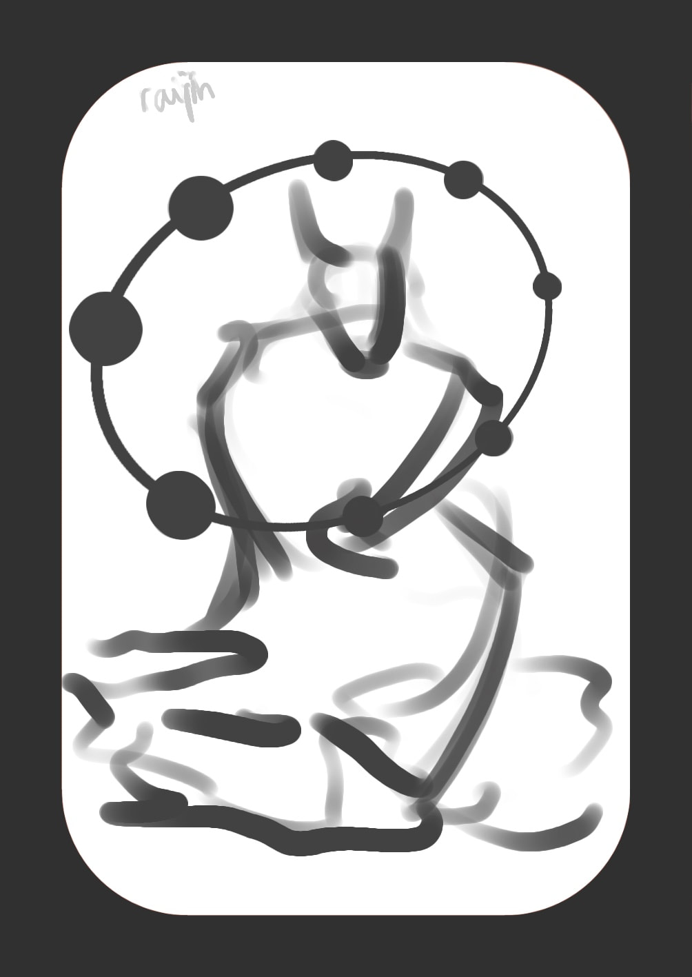
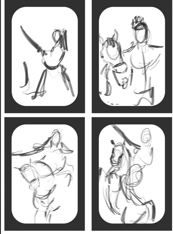
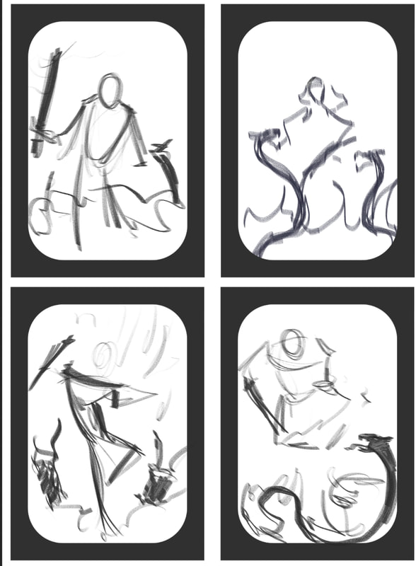
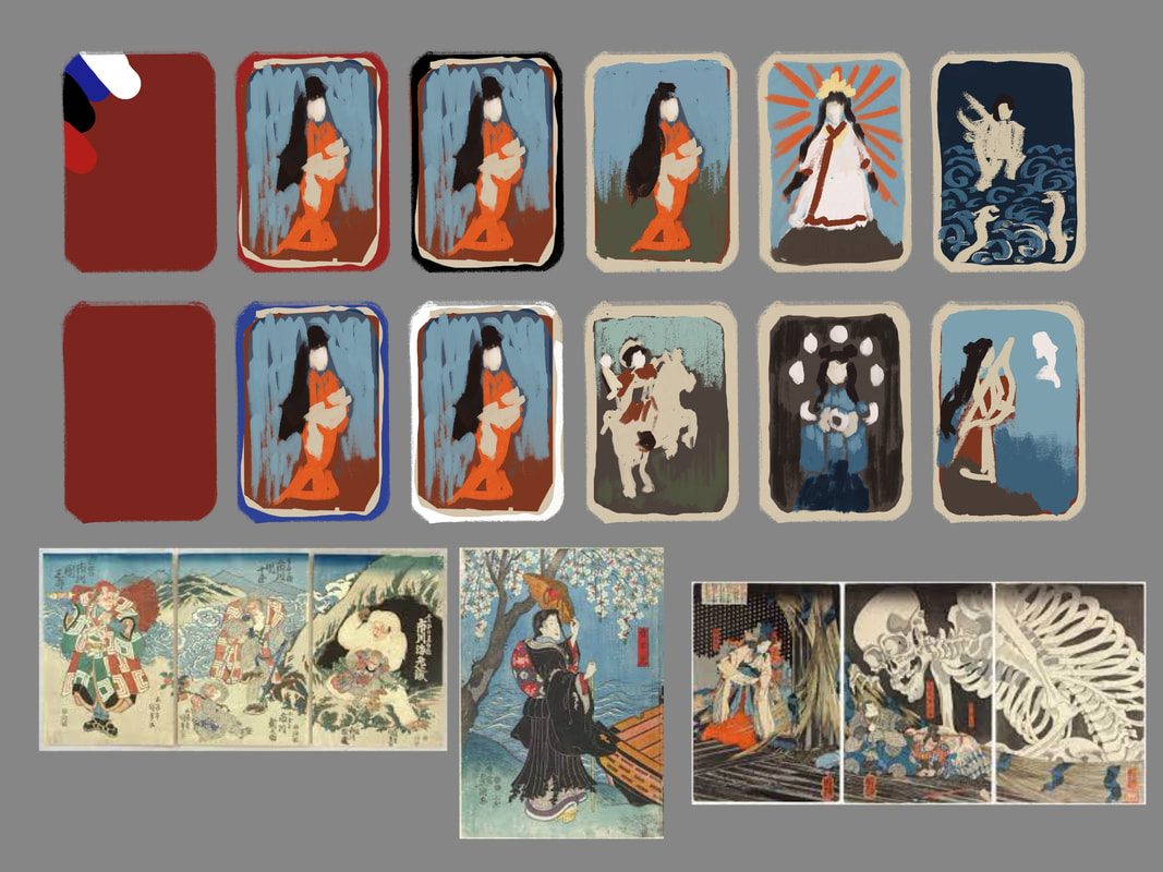
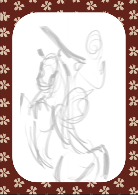
After choosing my strongest thumbnails I went ahead to explore ideas for the border of the card and liked the look of paper surrounding the design, further referencing Japanese woodblock prints.
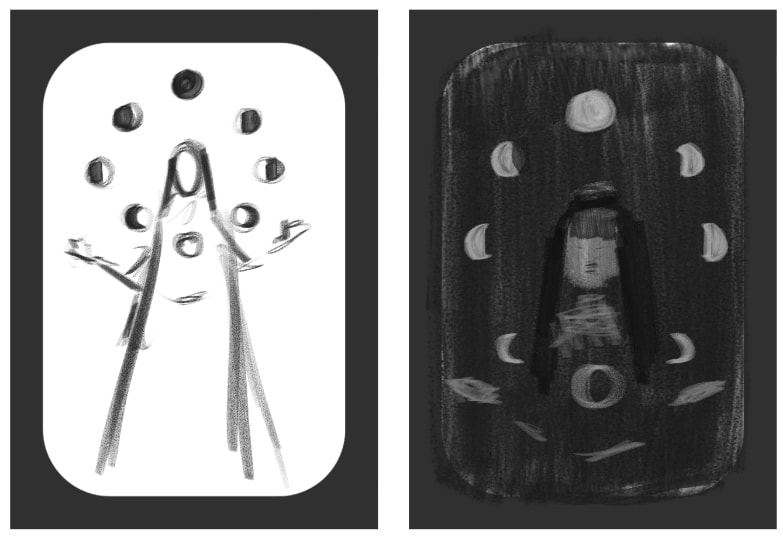
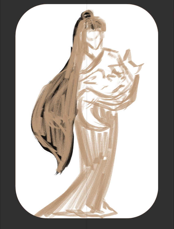
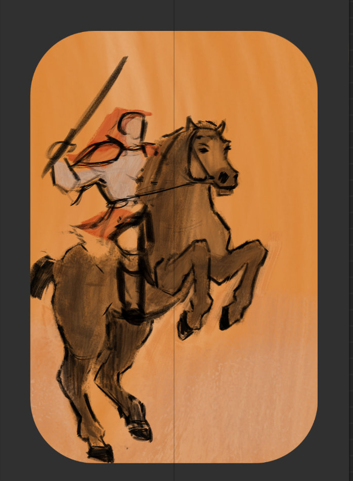
While choosing a cohesive colour palette for the set of six cards, I liked the idea of making the visuals look textured and imperfect, which would add to the notion of making it look like hand printed cards.
While choosing a cohesive colour palette for the set of six cards, I liked the idea of making the visuals look textured and imperfect, which would add to the notion of making it look like hand printed cards.
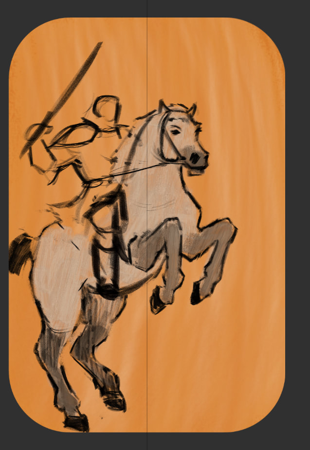
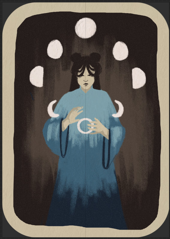
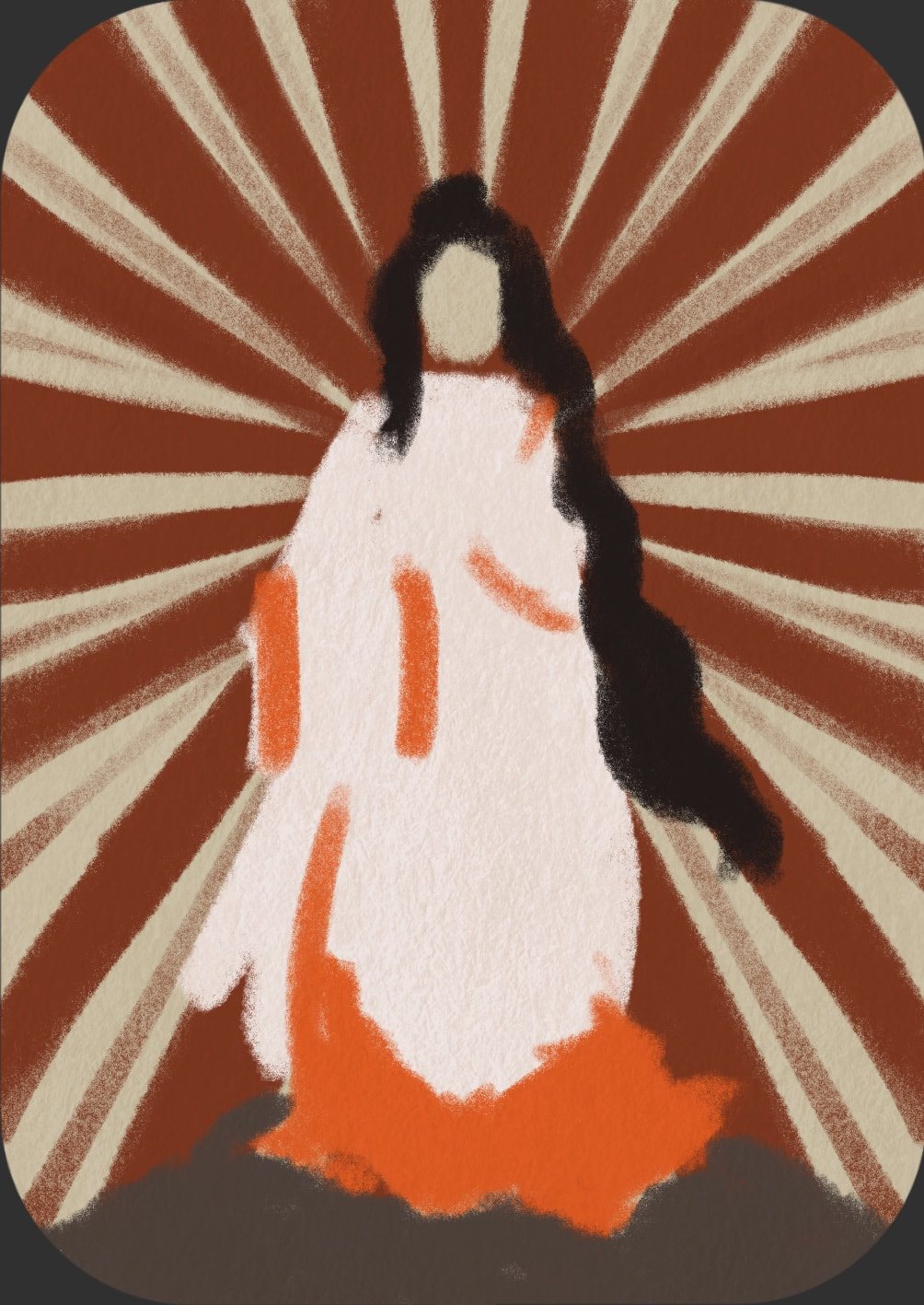
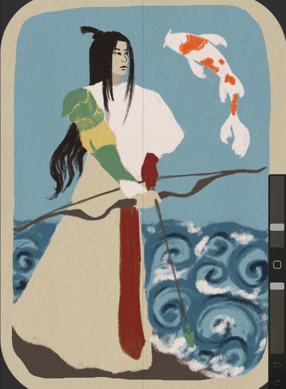
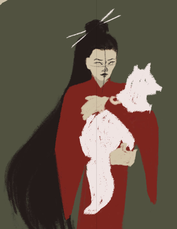
Work in progress
Back of the Cards and Box
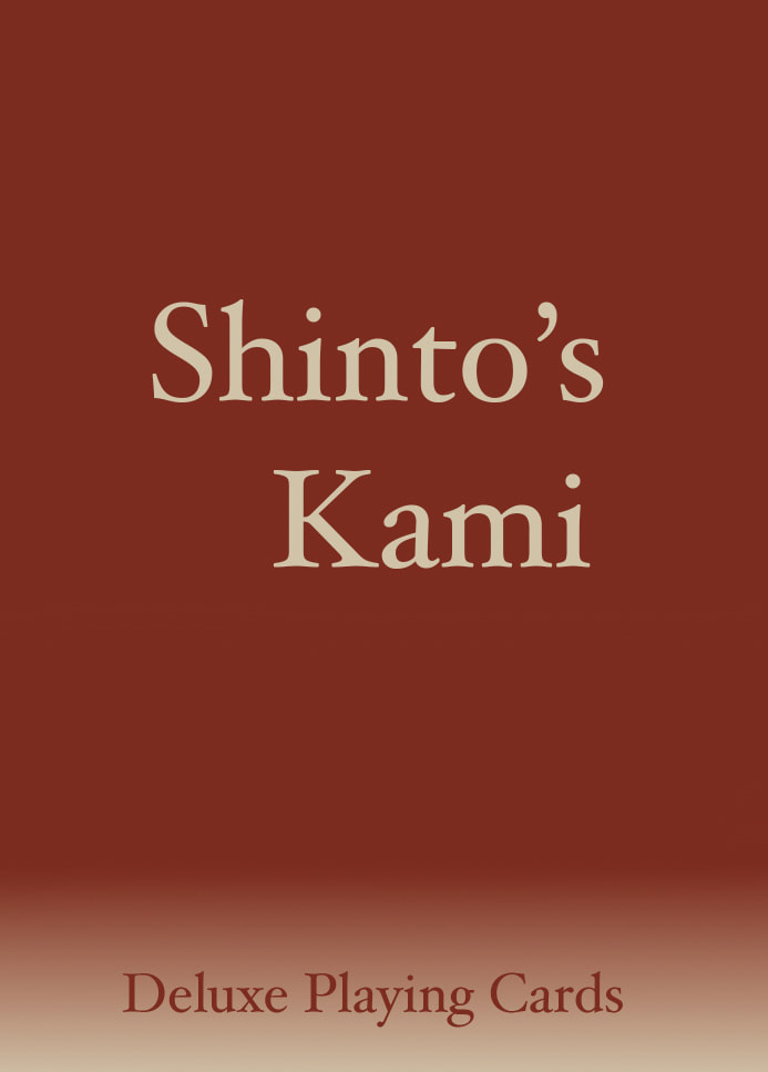
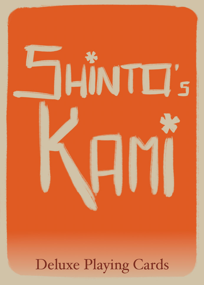
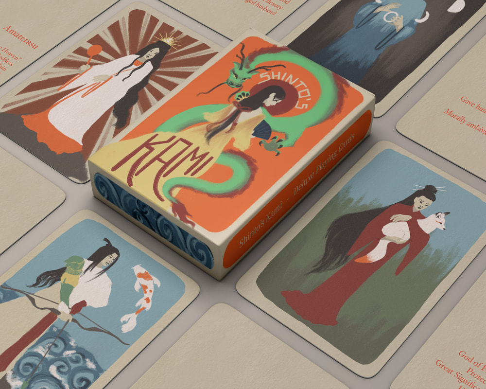
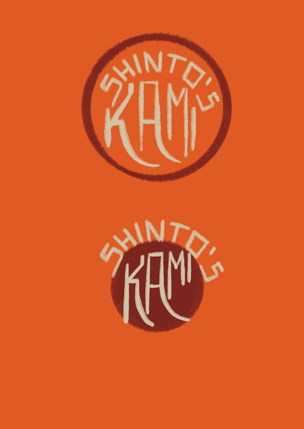
While designing the cards, I didn't think of the box design at first but knew it had to match the cards on the inside so that people would be able to judge what's on the inside. I went ahead and played around with custom type, as existing typefaces were a bit too boring for me.
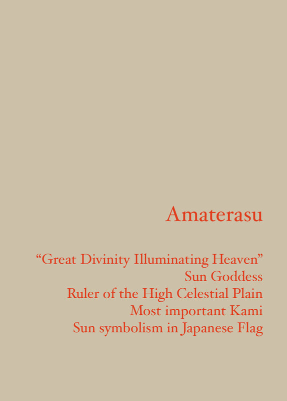
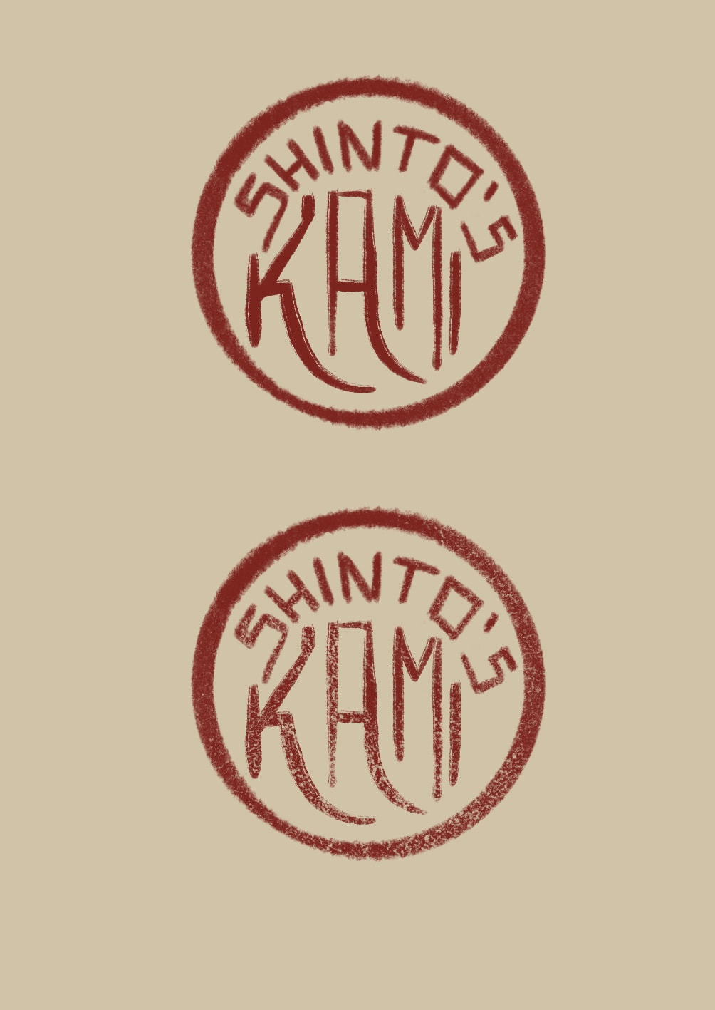
While I wanted to keep the main focus on the front of the cards, I felt as though it would look quite nice to add information about the Shinto God on the back of the card in red, referencing the colour of the stamps used to signify ownership of pieces of art in China and Japan.
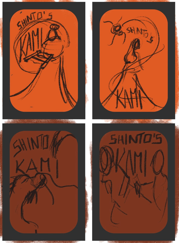
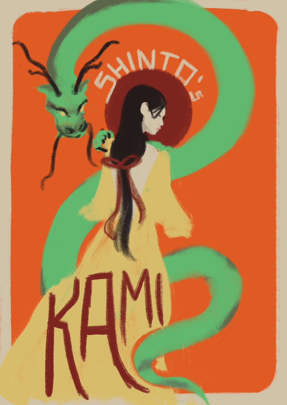
After having figured out a style for the font for the information on the back and for the front of the box, it made sense to thumbnail ideas in colour of what the front design could look like. I didn't want to reuse one of the card designs on the box as that would be rather lazy and uncreative.
Once the design was decided, I made sure to incorporate the title/text as flawlessly as possible.
Once the design was decided, I made sure to incorporate the title/text as flawlessly as possible.
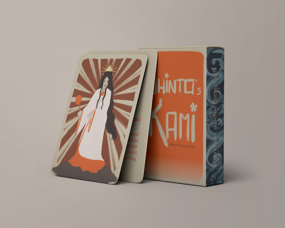
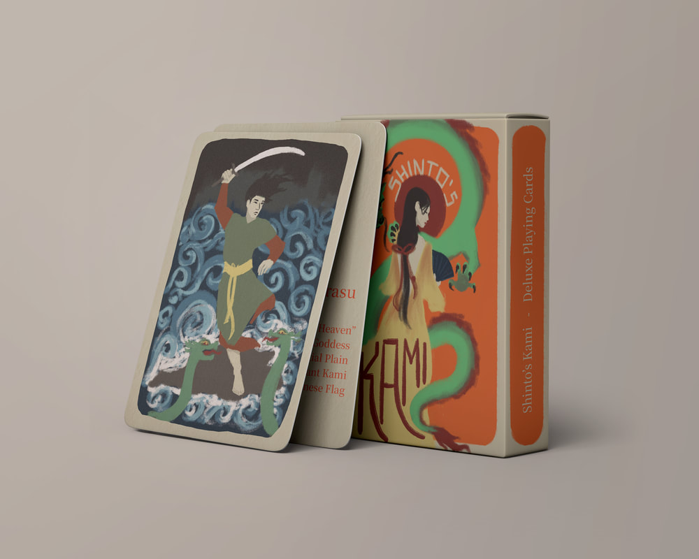
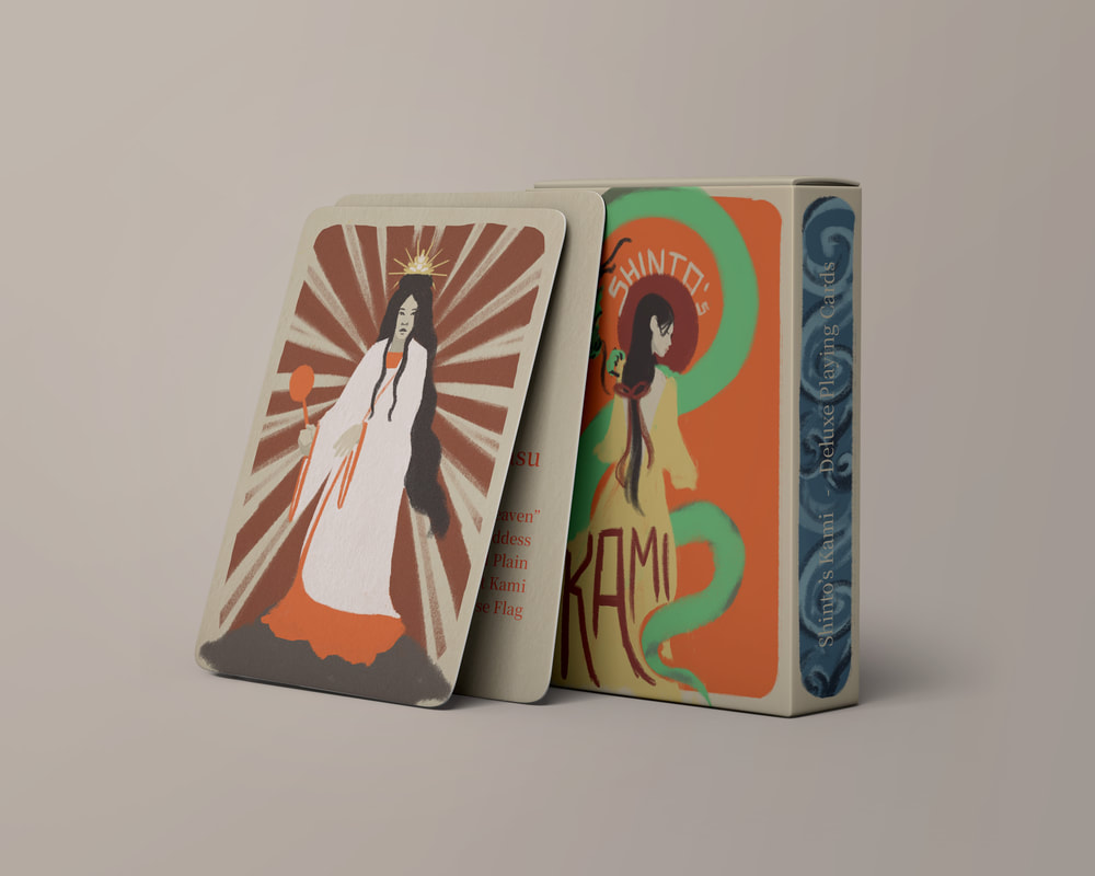
After having chosen my favourite design it was just a matter of putting it all onto a mockup and present it nicely.
As a final touch to the back of the cards, Tony advised to possibly change the colour of the title text, so that it would be easier to know what to read first. As well as that it was a good idea to add a 'fake' stamp to the back of my cards, referencing Chinese and Japanese stamps of ownership.


