The Borgias
The first week back at third year illustration started off with a brief combining history with one of the following elements: stamps, book, exhibition and animation. We were to choose one of those options after having decided what historical subject to tackle.
since I never heard anything about the Borgias, I decided to take them on to create a 1 minute animation (any format we would like) , possibly using Blender or Adobe After Effects.
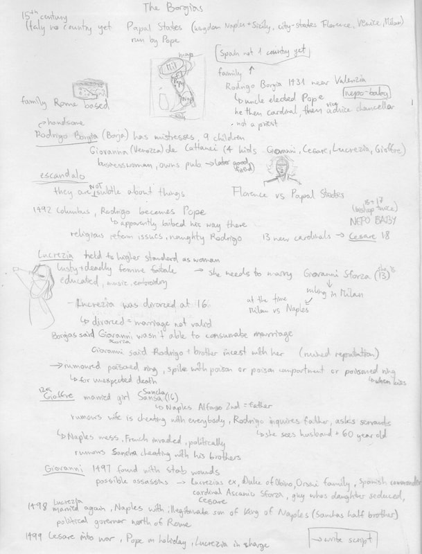
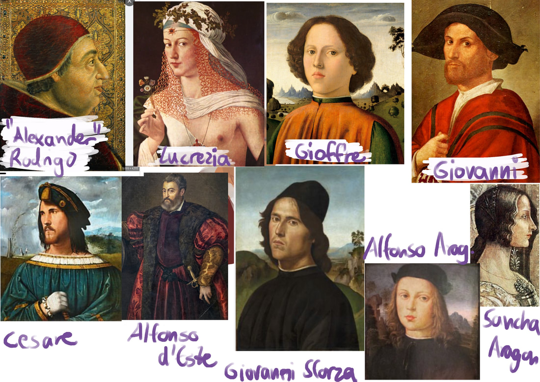
Before starting out with anything else, I listened to the podcast given and started conducting my own research to grasp the concept of my chosen topic fully.
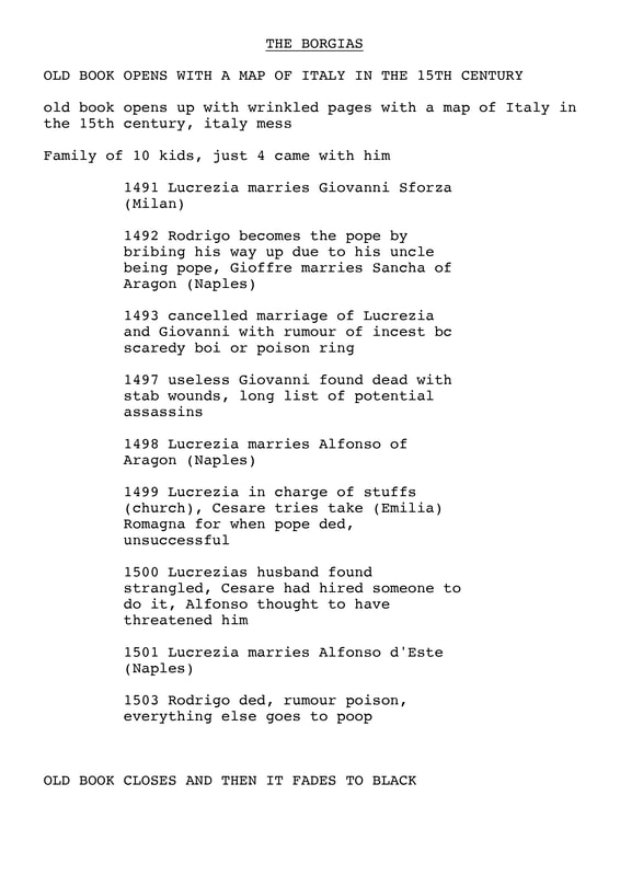
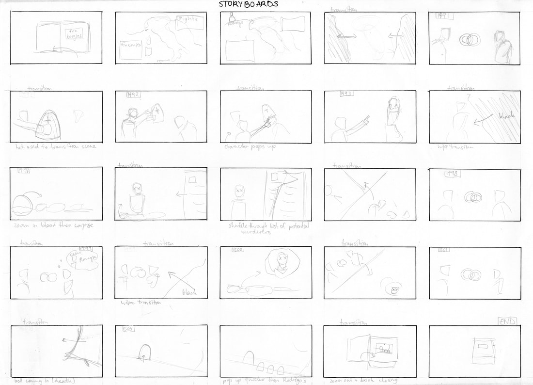
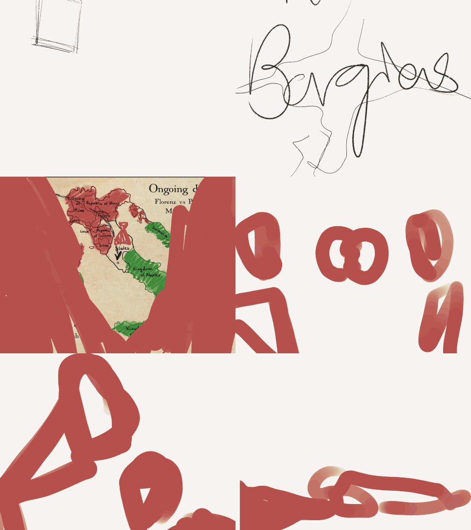
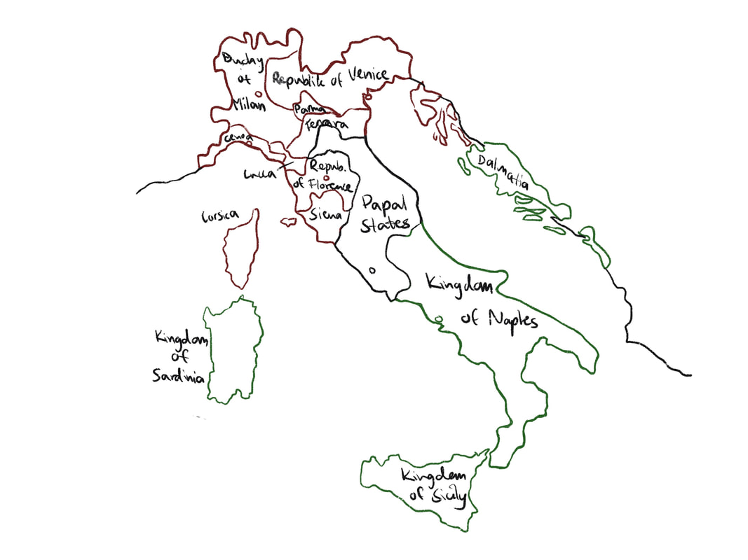
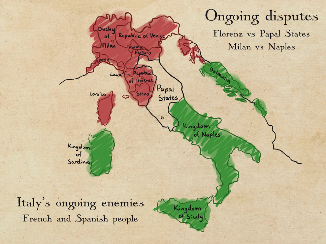
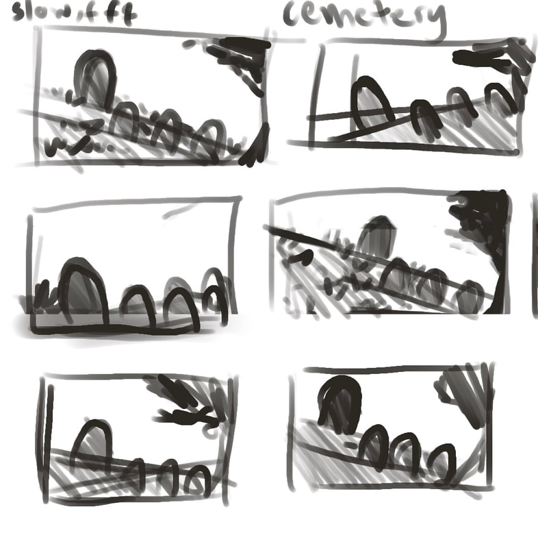
After completing the research process I wrote down a loose script of what I would like to happen in the animation, and would later flesh it out word for word. As well as that, I sketched out my first idea of the full storyboard and was quite happy with it straight away. Due to working very quickly from the get go, it would allow me to be able to tweak things later on.
|
|
|
|
Inspiration
At this point I was also thinking of how to approach this animation stylistically and took inspiration from how Genshin Impact tells bits of the story in a very beautiful, illustrative manner and thought to incorporate that somehow into my work.
|
|
|
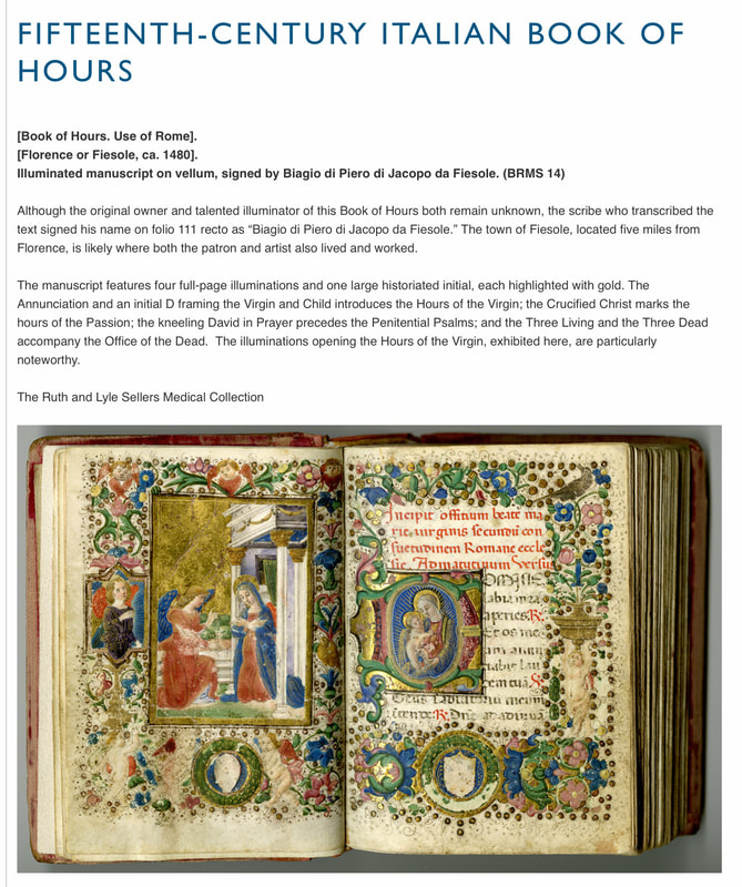
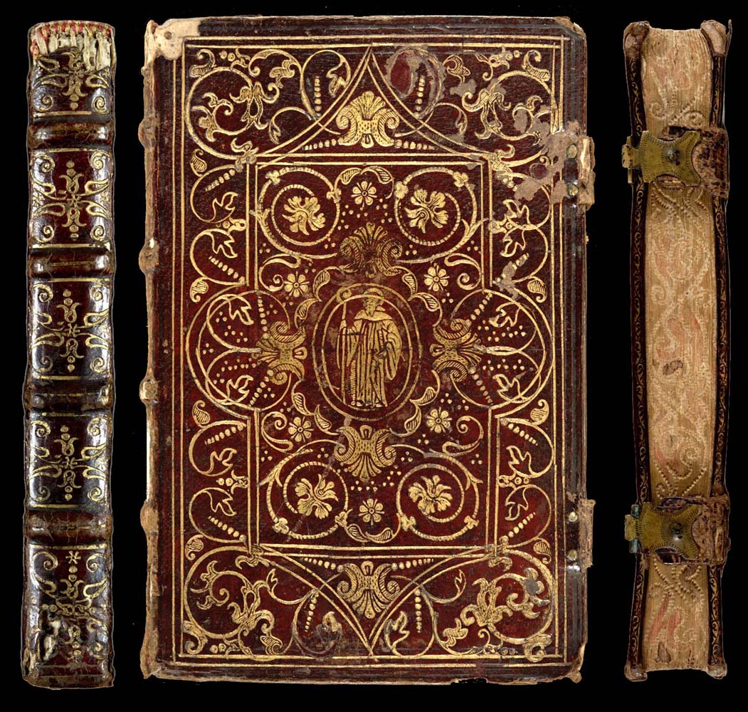
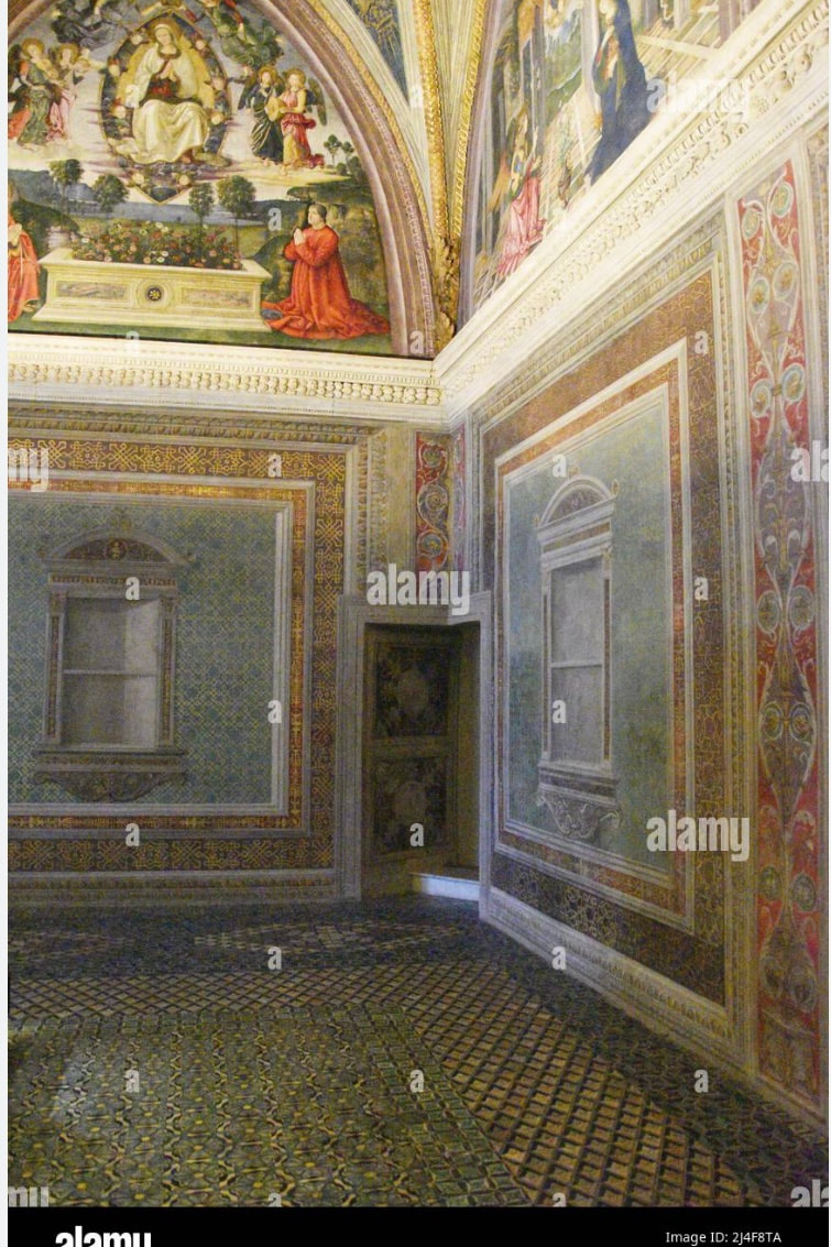
As I was wanting to start my animation with a book coming in that opens and "tells" the story of the Borgias, I was thinking of how Shrek introduced people to the story by starting with a book for nearly all four movies. I wanted to have that same storytelling feel to it and expanded my research to look into 15th century books, to make sure that people who watch my animation know instantly what timeframe the Borgia dynasty was set in.
|
|
|
|
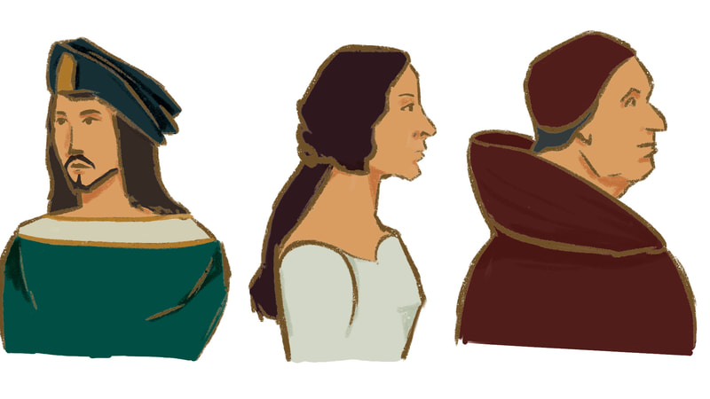
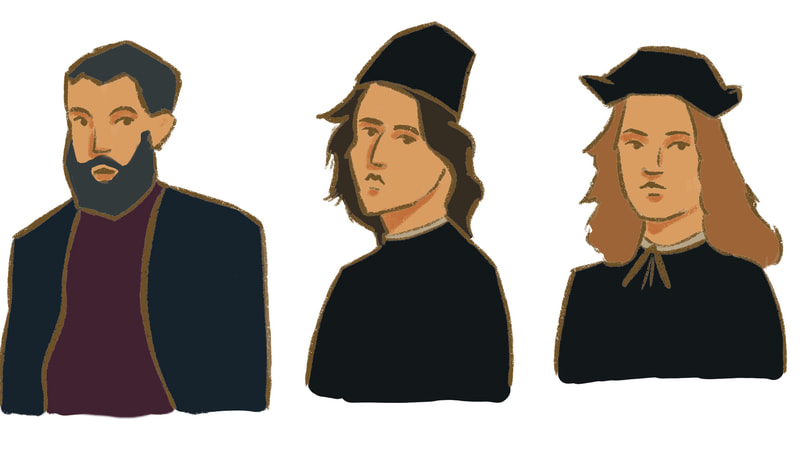
Below here I have included a few artists' work to see how they break down complex forms into simple shapes, which is what I would like to do myself for this animation. Tony mentioned how I can think about how to incorporate different patterns and textures into my animation work as well and started to experiment with this.
Illustration/Animation Tests
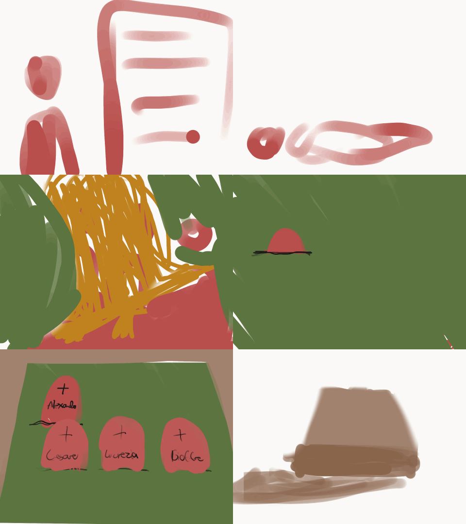
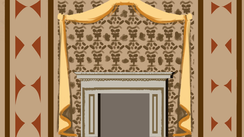
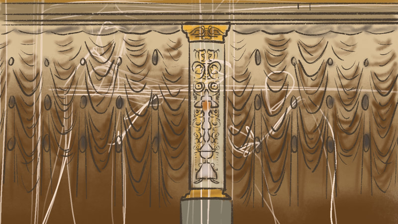
While I was trying to figure out my stylistic approach for this project and how the overall aesthetic of the animation is going to look, I took my initial storyboard ideas to procreate to see how each scene could flow into each other, possible taking advantage of transitions I could later on insert through After Effects' features.
Very crude animation test I didOn the right I uploaded an animation test I did very quickly on After Effects to see whether I would be able to use it to my advantage. Even though it is very crudely made, I am confident that I will be able to use this technique now and in the future.
|
|
|
|
|
I liked the idea of having a book come in at the beginning and end, which would give the animation a full circle moment. I have to mention that it was quite challenging, as I had to figure it out mostly by myself as I wanted the book to open and for it to have pages on the inside. The tutorials I found only looked at 3d books that wouldn't open or magazines that would open.
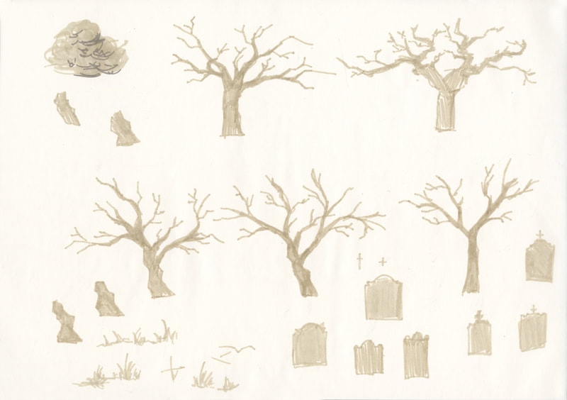
During my process of completing the illustrations to be used for my animations, I took the time to experiment with stylistic approaches and did artist studies of Patrick O'Keefe's copic marker drawings, as I liked the way he broke detail down into simple shapes and values and wanted to bring that into my own work.
After finishing illustrating each element needed for my animation, I imported them into After Effects and used these tutorials to help me refresh my memory of certain effects I wanted to use to bring my illustrations to life.
Tutorials used (some only partially)
I made sure to take what I needed from each tutorial and make it my own!
|
|
|
|
|
|
|
|
|
|
After animating each element, I decided to enhance my narration and visuals with various sound effects.
I knew that my deadline had to be Thursday, due to the fact that my animation had to render (30 to 40 mins). Allowing myself to finish then would also lend me a big hand in being able to spot any mistakes (i.e. audio cutting out or elements disappearing)
I knew that my deadline had to be Thursday, due to the fact that my animation had to render (30 to 40 mins). Allowing myself to finish then would also lend me a big hand in being able to spot any mistakes (i.e. audio cutting out or elements disappearing)
References utilised
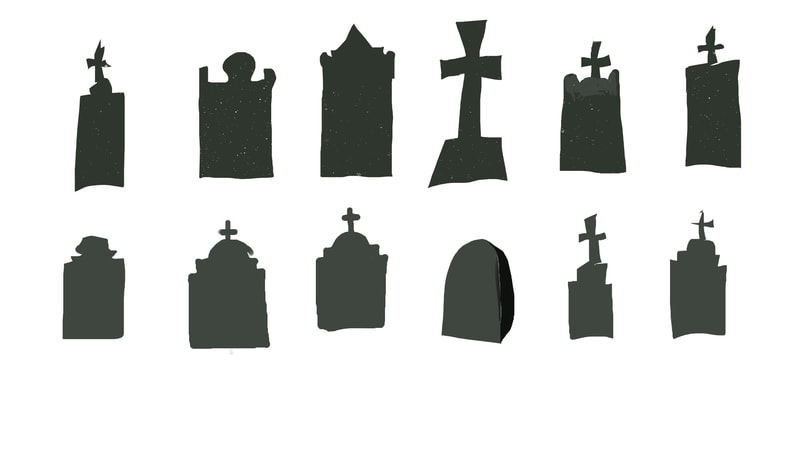
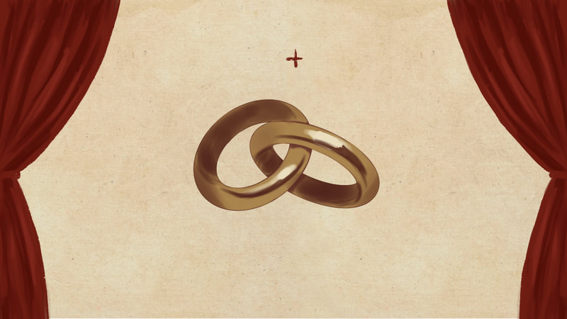
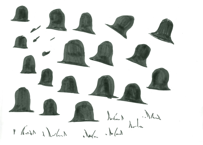
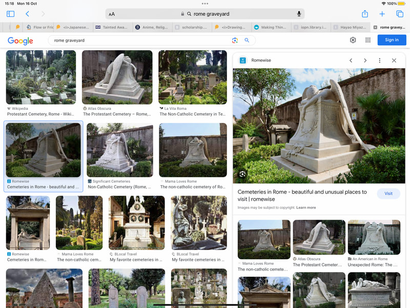
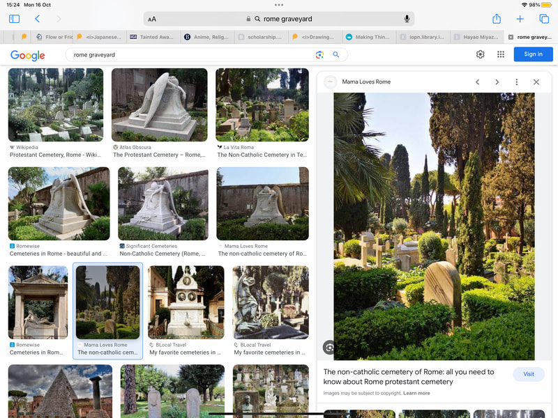
After tony feedback: After 3 weeks of work, I was able to show Tony a draft of my animation. He suggested to let the wedding rings move into frame, as well as make the entire colour palette of the illustrations more vibrant, especially since the funeral scene was lacking colour and "italian-ness" (tree wasn't italian enough).
